| Picture | Words |
|---|---|
|
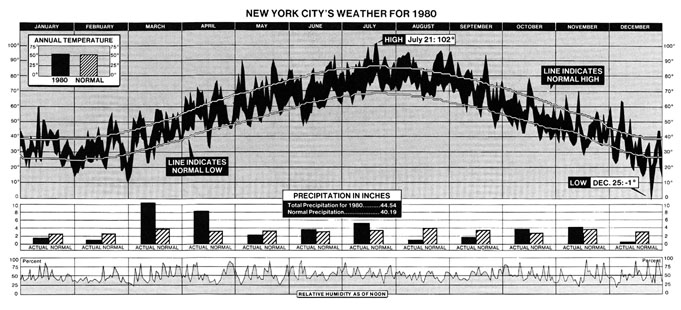
New York weather in 1980
Full size (861 x 310) [76k]
Description: Newspapers and magazines usually choose simplicity over detail, because it is hard to show much information in a single, comprehensible display. A collection of truly bad examples from the popular media are shown on our Darts pages. Here, the attention to detail, and to graphic design are evident. This graph, from the New York Times (Jan. 11, 1981, p. 32; Tufte (1983), p. 30) shows--- both valiantly, and sucessfully--- 2200 numbers which summarize the trends and patterns in weather in New York City in 1980. The three aligned charts show temperature, precipitation, and relative humidity. In the graph of temperature, the area is filled between the daily low and daily high. What makes this graph successful, in spite of the large amount of information presented are (a) clear visual comparisons between the 1980 data and the long-run average, (b) clear textual labels, (c) visual segregation between the three series. For example, it is easy to see that March and April were about of normal temperature, but a lot wetter. |
|
Turning Tables into Graphs Full size (441x721) PostScript image
Complex, high-dimensional data present special challenges to graphical display. Dan Carr describes the construction of this graph in the Statistical Computing and Graphics Newsletter, V6(3) [scgn-06-3.pdf] of the ASA Statistical Computing and Graphics Section . Carr says: A little effort went into splitting the data set into cells, some went into making a function to plot the data in a cell, and a great deal of effort went into attending to details |
|
|
Steve Majewski's Boxplot.
Description: The graph represents elemental concentrations of Calcium derived from least squares fit of filtered X-ray Energy Spectra - measurements taken from Cytoplasm, Mitochondria, and over the whole cell from treated and control samples. The data points are printed with jittered/randomized X coordinates, to keep them from overprinting and obscuring each other. The boxes are "standard" boxplots (using a modification of the standard XlispStat boxplot function) showing the median value, boxing the inner quartiles, and showing the max and min range. The white and gray ovals are centered around the weighted means of the data, with the vertical radius being one and two standard deviations, respectively. The thin gray horizontal line is the mean of the combined data. |

|
Trellis plot of Barley data
Full size (384 x 987) [15k]
Description: The figure is a Trellis display of data from an agricultural field trial of barley yields at six sites in Minnesota; ten varieties of barley were grown in each of two years. The data were presented by R. A. Fisher in The Design of Experiments and analyzed subsequently by many others. William Cleveland's display of these data shows an apparent surprise missed by previous investigators, which occurs at the Morris site: For all other sites, 1931 produced a significantly higher overall yield than 1932. The reverse is true at Morris. But most importantly, the amount by which 1932 exceeds 1931 at Morris is similar to the amounts by which 1931 exceeds 1932 at the other sites. More displays, a statistical modeling of the data, and some background checks on the experiment led to the conclusion that the data are in error -- the years for Morris were inadvertently reversed. The background of the data, and analysis with Trellis are described in more detail in these Case Studies and (in PostScript format) in The Visual Design and Control of Trellis Display The graph uses main effect ordering to arrange the 6 sites and 10 barley varieties from bottom to top according to increasing values of the median yields (collapsed over other factors). This greatly aids perception of trends in the data and makes the Morris data stand out as unusual. |
|
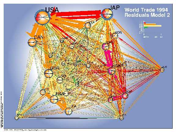
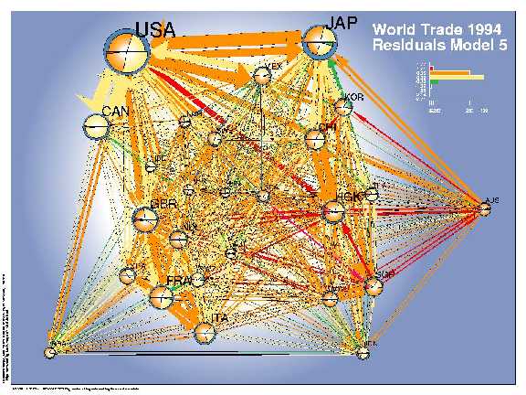
Network visualization for a multivariate model for world trade. Full size:
Simple model (576 x 432) [60k];
Final model (576 x 432) [61k].
From Lothar Krempel and Thomas Pl�mper, Exploring the dynamics of international
trade...
Description: Network diagrams are often used to show the relations between pairs of objects. Among other difficulties, it is hard to produce a pleasing arrangement of the nodes and links, and hard to use a network diagram as a data display. Krempel and Pl�mper used the geographic distances among 26 countries with a spring-embedding algorithm to obtain a simplistic geographical layout. They fit a series of regression models predicting the amount of bilateral trade between these countries, and used the network diagram to show both the data (trade volume) and the residuals (errors) from a given model. This visual procedure was used to suggest additional variables to be included into the models. The network diagrams show the volumes of bilateral trade (sizes of the arrows) and use colors to depict the errors of a given model--- which countries trade more than estimated (orange, red) or less (green, blue). The size of the country symbols stands for their volume of trade (in $ US), the balance of trade can be read from the comparision of the imports (bottom) and the exports (top). The pie slices indicate the degree to which the volume of the imports and exports (size) of a single country are overestimated respectively underestimated (colors). Model 2, which accounts for geographical distance and the GDP of the importing and exporting countries, shows a systematic regional imperfection of the estimates for the Pacific region. An enhanced model accounts additionally for joint borders, joint oceans regional economic areas and yields an improved fit. Nevertheless one can easily detect a systematic component in the errors, which points to the importance of the former British Commonwealth (GBR - HKG - AUS) for which the trade volumes are systematically underestimated. |

|
Interactive World Health Chart.
PDF, Full size (841x595) [50k]
Interactive version
Description:
Making complex information about social and human development throughout the world available
and understandable is as difficult as it is important.
In addition to the very nice interactive applications, the static graphs are also models of clarity of
graphic design.
|
|
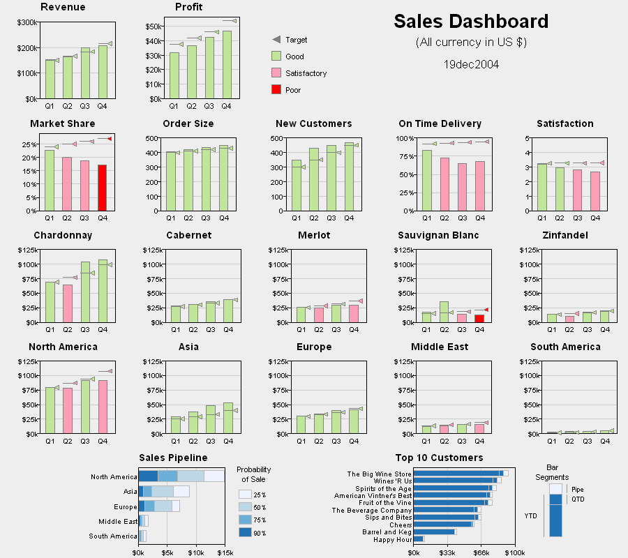
Dashboard design for business information display.
Full size (900 x 800; 33K) (with tool tips
and data links)
Description: DM Review sponsored a data visualization contest related to data presentation for buisness purposes. One scenario was to create a 'sales dashboard' that highlighted aspects of poor performance for a company. This entry, by Robert Allison of SAS Institute was the winner, and a lovely example of a multi-panel dashboard display for business decision. It combines a variety of indicators in a coherently organized display: Revenue and profit, performance metrics, product (wine) type, and region, with well-designed color coding and target indicators. One can easily see that while revenue and profit were good and rising, market share was falling, as were delivery time and satisfaction, etc. See Robert's description of the approach and design for this display. |
|
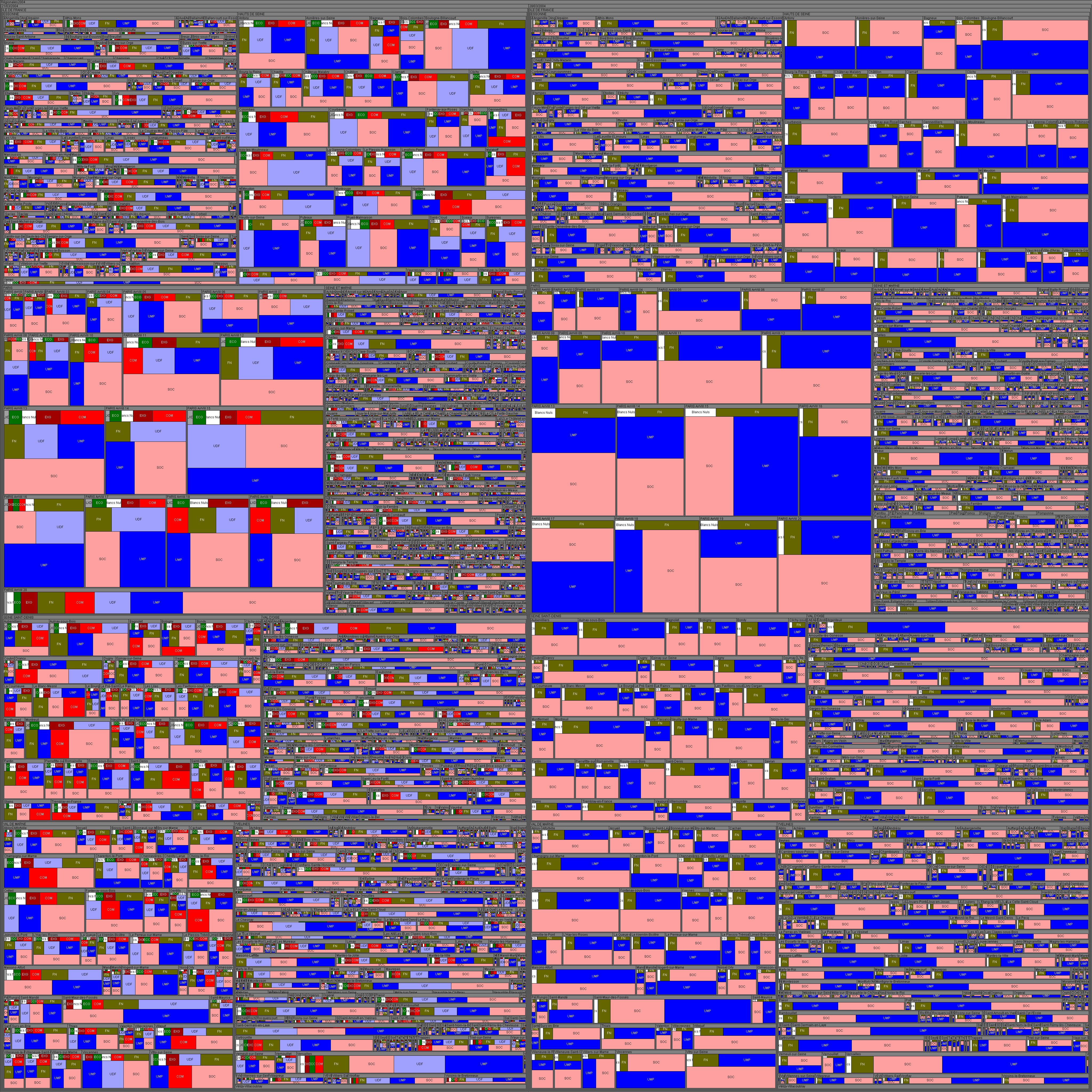
Treemap of French 2004 elections.
Full size (4096 x 4096; 583K)
Description: Treemaps provide an ideal graphic form for visualizing hierarchical data in a compact way, using nested rectangles whose area is proportional to some outcome, and which can be colored to show some categories. This example, from French Elections 2004: Data and Visualization, by Jean-Daniel Fekete shows election results in the Ile de France region surrounding Paris. There were two rounds in the election. For each department, the left rectangle represents the first round and the right rectangle the second. These rectangles for the departéments contain the cantons (approx. county subdivisions), which contain the communes (districts), which contain the results by political party. The area of each rectangle is proportional to the percentage of votes. The colors use the traditional French scheme of political parties: dark red for extreme left, red for Communists, pink for Socialists, orange for RDC, yellow for misc. left and others misc. parties, grey for misc. right wing parties, light blue for UDF, blue for UMP, military green for FN (popular extreme right wing party) and dark blue for other extreme right wing parties. White is for nul votes and black for abstention. There are many fine treemap examples; I chose this one for its exemplary attention to detail and execution. What is missing in this static view is the ability to zoom in and out dynamically, dividing or aggregating hierarchical levels for communes, cantons or departéments. |
|
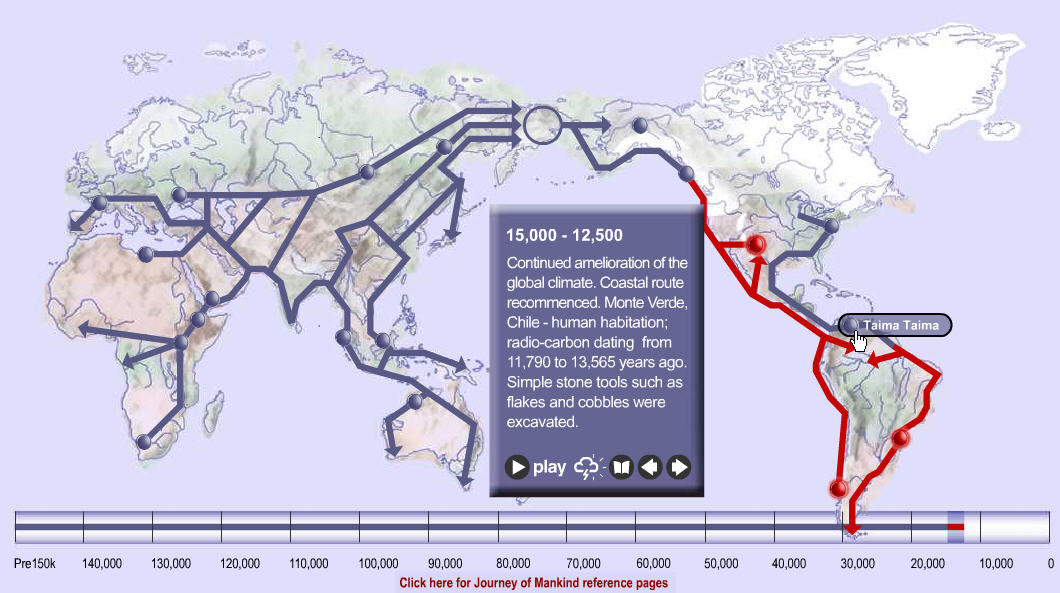
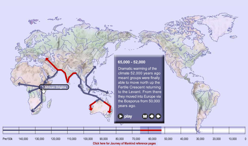
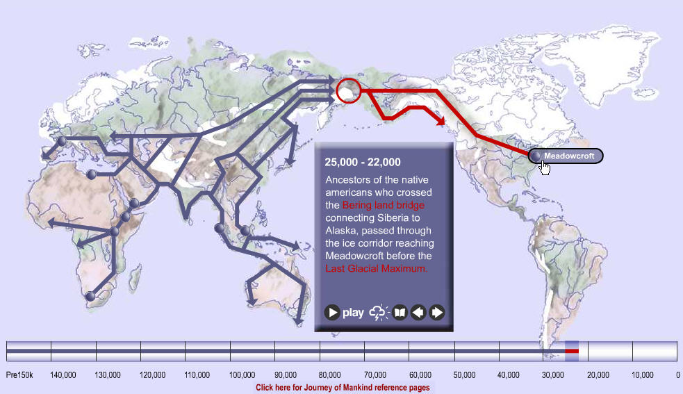
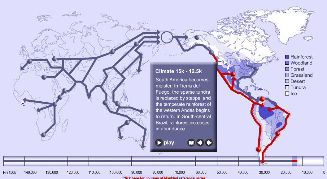
Telling stories graphically: The Journey of Mankind Images:
Snap 1: 65K-52K (988 x 582; 95K),
Snap 2: 25K-22K (983 x 567; 98K),
Snap 3: 15K-12.5K (1060 x 593; 112K),
Snap 4: 15K-12.5K (climate overlay) (1056 x 581; 105K)
Description: The Journey of Mankind: Peopling of the World, by the Bradshaw Foundation and Stephen Oppenheimer, is an interactive graphic narative, showing the interaction of migration and climate over the last 160,000 years. It traces the development of modern humans from our origins in East Africa through Asia, then Europe, then Central Asia and onward across the Bering land bridge through Alaska and into North America, finally populating most of the modern world by 8000 BC. (Some snap shots are linked above.)
Howard Wainer, who alerted me to this called it,
For a related site with static graphs, see Hominid Fossil Sites and Patterns of Hominid Dispersal. [Thanks: to Howard Wainer for bringing this to my attention]
|

|
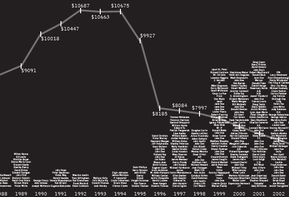
Telling stories graphically: Failure of The Common Sense Revolution
Full size PDF
Also: [Scatterplot version] [Data file]
Description: Scott Sorli is a graphic artist and architecture lecturer with a keen sense of social justice. This information graphic,"Common Sense Revolution tracks Ontario welfare income for a single person against the number of homeless who have died on the streets of Toronto over the past two decades. The year 1995 is particularly striking, the year that welfare income begins to plummet, the year that homeless deaths begin to jump, the year that the Harris conservatives were first elected." In the same spirit that Minard and Playfair brought to political topics, it succeeds in making the human consequences of political decisions manifestly visible: Welfare income is shown by the line graph, deaths by the stacked names of the homeless, too often John or Jane Doe. The public presentation of Scott's work is also of interest: It was prepared as a wall-sized digital print (82 x 135 in.), and displayed in a 24/7 gallery window not far from the main mental hospital in Toronto. An accompanying web presentation goes on to suggest some necessary caveats: While there is certainly a causal relationship between subsistence income and, well, subsistence, it is difficult to de-link with precision other causes of the rise in homeless deaths, specifically: the cancellation of construction of social housing by all three levels of government, the repeal of the Rental Housing Protection Act and its replacement with the Orwellian-named Tenant Protection Act; and the de-institutionalization of the mentally ill and developmentally disabled as the city's hospitals were being closed and cut back.Related: Article on this work in the Toronto Star, 8/23/07, p A12. [Thanks: to Scott Sorli for permission to publish his work here.
All rights to this image belong to Scott Sorli.
]
|
|
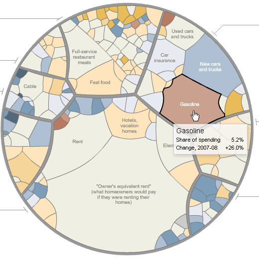
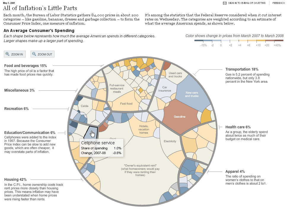
Interactive news graphics: All of inflation's little parts
Detail, full size (),
Static image, full size () ,
Link to interactive NY Times page.
Description: The Graphics Department of the NY Times, including Amanda Cox, Shan Carter and many others, has recently created a number of visualizations of complex phenomena that are at once stunningly beautiful and effective in communicating the essential ideas to a mass audience. Web-based versions now allow them to use dynamic and interactive graphics to go beyond what can be shown in static print versions. This image, from May 3, 2008, shows the changes in prices from March, 2007 to March, 2007 of various components of an average consumer's spending. The circular diagram is broken up into 8 main sectors, whose area is proportional to the percent of spending, and each of these is subdivided in proportion to sub-categories. A bipolar color scale is used to shade each region, using shades toward redish-brown for increases and shades toward blue for decreases. The interactive version of this diagram uses tool-tip boxes to show the details and allows zooming in on components whose labels cannot be shown in a static graph. The basic graphic form is an adaptation of a pie chart to a hierarchical data structure, based on the idea of a Voronoi tree-map by Michael Balzer and others at the University of Konstanz. For other examples of NY Times interactive graphics, see:
|