| Picture | Words |
|---|---|
|
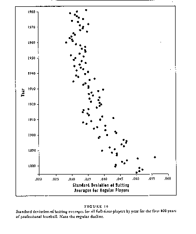
Goosed-up Graphs.
Full size (403 x 480) [2k]
(from Gould, Full House (1996), p.109, fig 16)
It is always distressing when one of your heros commits a graphical sin, even more so when that sin (if only venal) was unnecessary (like stealing candy when you have plenty at home), and the argument would have carried the day without it. Stephen Jay Gould argues forcefully in Full House that the absense of 0.400 hitting in baseball since Ted Williams' 0.406 season in 1941 has more to do with a decrease in variability among players than with any decline in overall performance in batters, or increase in the opposition (fielding, pitching, etc). He presents this graph to show---as anyone who is not blind can see-- that the standard deviation of batting averages has declined regularly and precipitously over the history of major league baseball. There are several problems with this graph, but the sin is that it has beeen formatted to present the decline in variability in the most goosed-up way. First, the XY axes have been interchanged, permitting a portrait-shaped graph to show a steeply negative slope. Second, the range of the horizontal axis (standard deviation) has been limited to make the slope as steep as possible. |
|
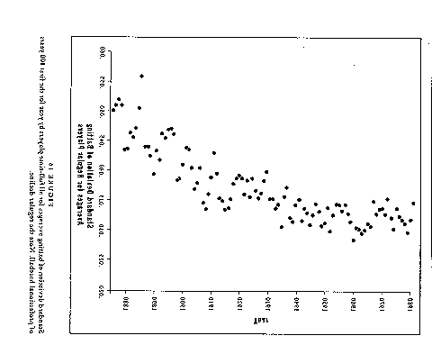
... de-Goosed.
Full size (480 x 403) [2k]
(from Gould, Full House (1996), p.109, fig 16, transposed)
The graph should be re-designed, but a fairer representation of the change in standard deviations of batting averages over time is obtained simply by flipping the graph about a 45o diagonal, placing Year on the horizontal axis. We still see a decline in variability of batting averages over time, but not nearly as dramatic as in the original graph. We also see (if we can read mirror-writing) that the greatest decline in variability occurred between 1880--1910. After 1910, there has been some decline, but only enough to excite the sabermetrician of 3rd decimal places. |
|
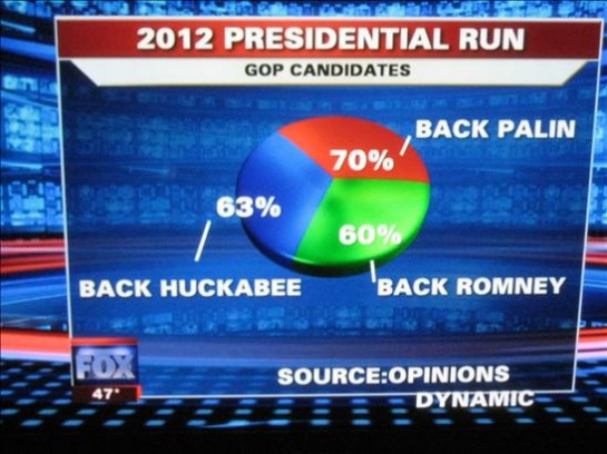
Fox News: The Best Pie Chart Ever
Full size (545 x 408; 86K)
Description: Any fool can make a pie chart, but it takes great genius at Fox News to design one like this that won the award from FlowingData for the Best Pie Chart ever!
[Credit: Thanks to Gilles Palsky for bringing this to my attention.]
|