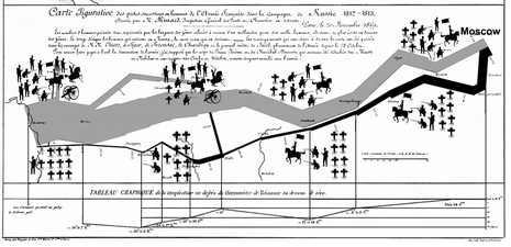
I use "re-vision" in the sense of both "to revise" and "to see again", possibly from a new perspective.

| Original | Schematic |
|---|---|

| 
|
| Picture | Words |
|---|---|
|
Mathematica graphic
Full size (297x183)
In Chapter 4
of
Applied Mathematica: Getting Started, Getting it Done,
Shaw and Tigg (1993)
describe
a Mathematica function,
A simpler function, |
|
Grammar of Graphics
Full size (561 x 267; 22K)
In Chapter 15 of The Grammar of Graphics, Wilkinson (1999) describes the encoding of the information from Minard's graphic according to his graph grammar. This is notable because the specification for the graph is declarative (what the graph consists of) rather than procedural (how to draw it).
|
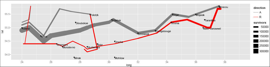 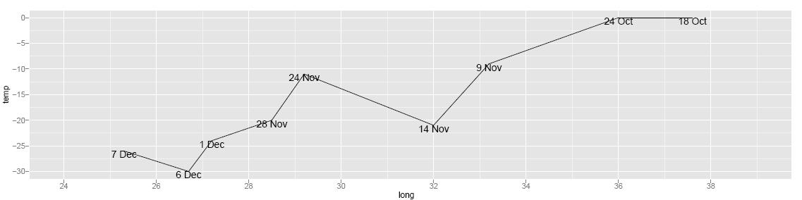 |
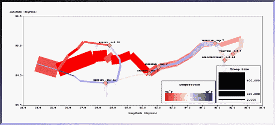
ggplot2: Grammar of Graphics in R
March graphic, full size (1139 x 286; 49K),
Temperature graphic, full size (1137 x 284; 31K),
ZIP archive containing data and R code (56K)
Hadley Wickham has implemented most of the ideas in the Grammar of Graphics in the R package ggplot2, available from CRAN servers. In these images, Hadley chose to illustrate the simple use of ggplot2 to produce separate graphs of the flowmap of troop strength and the change in temperature on the retreat. See minard.r for the ggplot2 calls that produce these images. This example is notable because, like the Grammar of Graphics specification, one can easily see the translation from the code (minard.r) to the graph. More so, because the ggplot2 source code is freely available, so one can easily use it or extend it. |
|
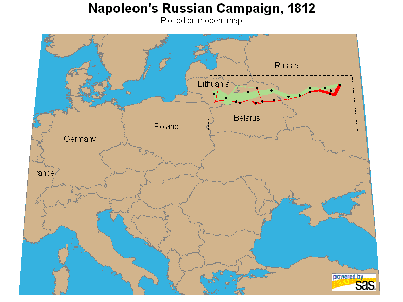
SAS/IML Workshop
Full size (1148 x 619; 19KB)
SAS/IML Workshop is client-server extension of the SAS Interactive Matrix Language, with an object-oriented flavor. This version, programmed in NapoleonsMarch.iml, works by defining a data structure and modules suitable to drawing paths on a 2D surface, a generalization of Minard's idea of the flow map. |
|
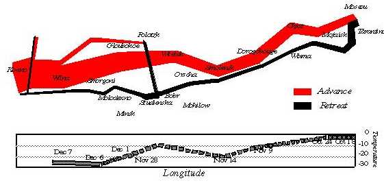
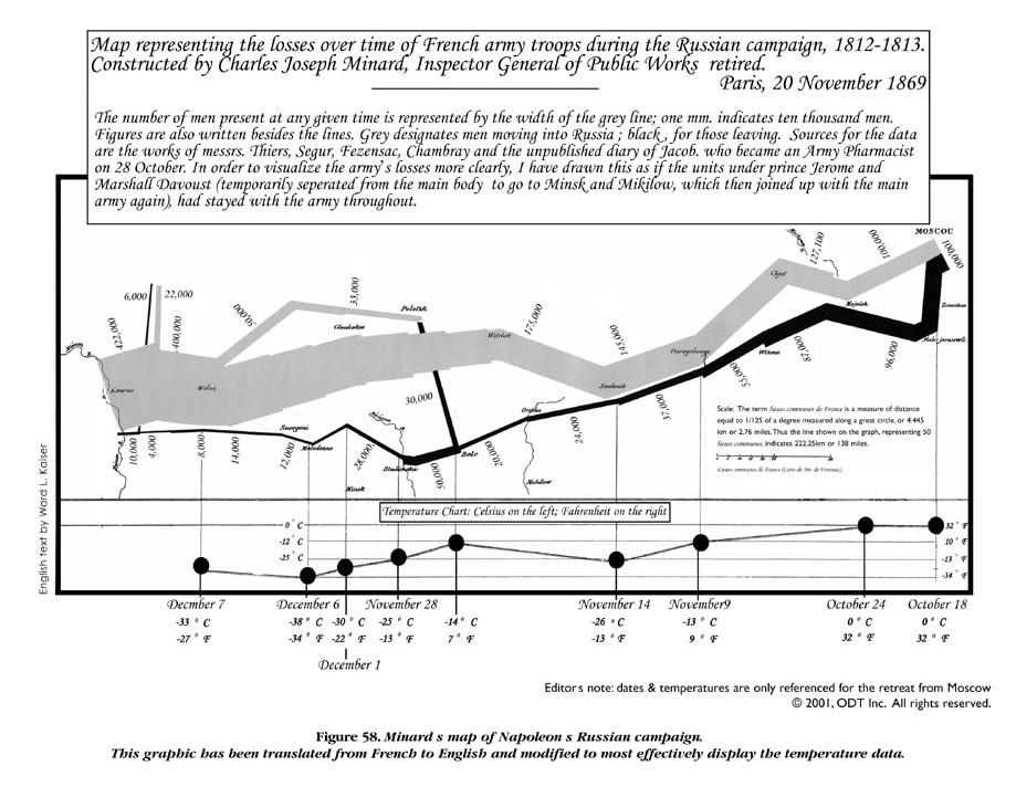
English translation
Full size (919 x 712; 158K)
ODT Maps has recently published Seeing Through Maps: The Power of Images to Shape Our World View by Ward Kaiser and Denis Wood. It contains this version of Minard's image with the caption translated into English and displayed legibly. The scale of temperature is displayed in both F and Celsius and given somewhat more prominence and readability. |
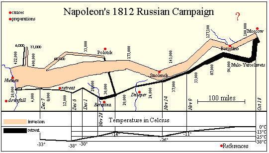 |
Image Map
Full size graphic (541x308) [9K]
The WWW and other new technology (CD rom, DVD) allows the easy integration of the easy integration of text, graphics, sound, and other media. Andrew Donoho teaches an Information Design course at the University of Texas at Austin. For the past several years, a course project asked students to design a web presentation based on Minard's graphic. Sunny's page is one example of the graphic linked (as an image map) to pages of text describing the major battles of the campaign. Lori Eichelberger's page is another example, relating the March on Moscow to the memoirs of Francois Bourgogne, a Sergeant in Napoleon's Imperial Guard. Other interesting attempts may be found on the LIS Class Projects page. |
 |
Best online image
Full size graphic (1762 x 833) [178K]
From John Schneider's Napoleonic Literature page; this is the largest and most detailed re-creation of Minard's graphic I have found on the Web. All the place names and troop strengths are highly legible. The Napoleonic Literature site contains many electronic books and a wealth of information. |
 |
Integrating temperature information
Full size graphic (541x308) [9K]
SAGE design page
This graph, from the Visualization and Intelligent Interfaces group at CMU is one re-design, attempting to link the information about temperature directly to the path and strength of Napoleon's army, emphasizing their interrelations more directly. The (X,Y) coordinates are still map-based (latitude and longitude). "The use of color clearly shows the heat wave during the advance and the steady decline in temperature through the retreat. The exception, a spell of temperatures above freezing, is clearly visible when the retreating army is between the cities of Krasnyj and Bobr." |
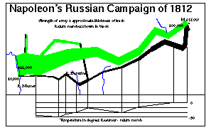
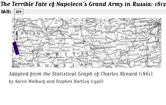
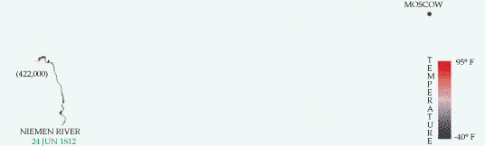
| Animated graphic
Full size graphic (536x182) [158K]
from Max Boylan's march page
Here is a similar graphic, but done as an animated GIF image, from Max Boylan at SFSU. We start with an empty map on June 24, 1812, as the campaign begins at the Nemen River with 422,000 troops. The animation shows the step-by-step progress of the Grand Army to Moscow and back. The coding of temperature by color is done somewhat better than in the SAGE graphic above. The animation repeats 10 times. |
|
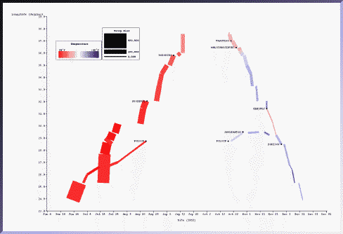 |
Making time explicit
Full size graphic (541x308) [9K]
SAGE design page
"The temporal characteristics of the march were weakly conveyed in the original because they were expressed as text labels. Here the relation between date, troop location (longitude only), and temperature is more strongly conveyed because they are all exp ressed as properties of the rectangles. Battle sites are indicated in text." |
 |
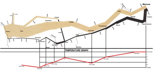
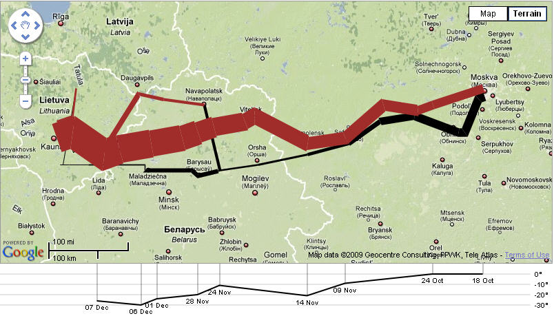
Animated graphic
Full size graphic (547 x 346) [388K]
This version, by Aaron Walburg and Stephen Hartzog, listed on the University of York History of Statistics page uses a real map of the region from Poland to Moscow as the background. It overlays on this an animated sequence showing the size of Napoleon's army (with dates), and the retreat, together with the decline of temperature. In many ways, this is my favorite modern rendition. |
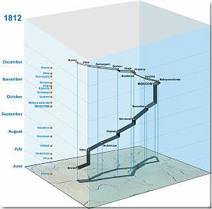 |
3D Cube graphic
Full size graphic (300 x 225; 20K)
This version, by Menno-Jan Kraak, of the International Institute for Aerospace Survey and Earth Sciences (ITC) is one of several 3D renditions on a lovely web site, Geovisualization and Minard's Map. This one unravels time into the 3rd dimension, superposed above the base map. The web site contains the largest collection of variations of Minard's map, with several interactive and animated versions, and a comprehensive list of references and other links. |
 |
The human side
Full size graphic (465 x 225; 56K)
In an article published in Technical Communication, August 2001, Dragga and Voss ``The Inhumanity of Technical Illustrations'' suggest that Minard's graphic does not convey the human cost directly--- ``We don't see the people and we don't see their anguish.'' They present this image using pictographs, which gradually change from soldiers to burial crosses, to illustrate how ``ethically conscious technical communicators could introduce the human element...'' Well, it is not clear to me that the addition of hokey clip art soldiers and crosses does much to enhance Minard's image, but chacun a` son gou^t! |
 |
A drill-down SAS GMAP with tooltips
Full size graphic (465 x 225; 56K)
Robert Allison created this two-level, zoomable version with interactive tooltips, as a lovely "proof-of-concept" example. He used SAS/GRAPH map data sets for the map information, and PROC GMAP to draw the map, using the SAS/GRAPH annotate facility to overlay Minard's data on the map. The interactive zooming and tooltips make use of the SAS ODS facility. See Robert's How I did this for further information. Here is the SAS code used to generate the maps. |
 |
Protovis: JavasSript toolkit + Google map
Full size graphic (804 x 459; 85K);
Protovis Minard example
Protovis is a graphical toolkit for visualization by Michael Bostock and Jeffrey Heer from the Stanford vis group. It aims to be a general system for constructing visualizations, and is implemented in JavaScript. This version uses the Google Maps API to overlay Minard's graphic on a Google map of the region. The demo web page shows the JS code and data used to create this version. Thanks to Antonio Saade for bringing this to my attention
|