| equate | Create AXIS statements for a GPLOT with equated axes | equate |
AXIS statements for a GPLOT with equated axes, and optionally produces a plot
using point labels (supplied in an input annotate data set).
It is used as a utility macro to create plots where angles between vectors
and distances between points have
meaning, so the axes should be scaled to the same physical units.
For the vertical axis variable Y it creates (by default)
an AXIS98 statement and for horizontal axis variable X it creates an AXIS99 statement. These use the ORDER=
and LENGTH= parameters to ensure
that an inch on the vertical axis represents the same data
range as an inch on the horizontal axis.
If the maximum plot dimensions XMAX= and YMAX= are not specified, the EQUATE macro uses the GASK call to obtain the maximum values from the device driver.
%equate(data=inputdataset, X=xvar, Y=yvar, ..., )
Reset the defaults below to be more suited to your devices.
As well, use GOPTIONS HSIZE= VSIZE=; to allow the maximum plot size if you do not specify the XMAX and YMAX
parameters.
PLOT=YES)
PLOT=YES.

%include vcd(equate);        *-- or include in an autocall library;
%include vcd(corresp);       *-- or include in an autocall library;
data victims;
   input crime $ Rape Assault Robbery PickPock PLarceny
                 Burglary HLarceny AutoThft;
cards;
Rape        26   50  11   6    82   39   48   11
Assault     65 2997 238  85  2553 1083 1349  216
Robbery     12  279 197  36   459  197  221   47
PickPock     3  102  40  61   243  115  101   38
PLarceny    75 2628 413 329 12137 2658 3689  687
Burglary    52 1117 191 102  2649 3210 1973  301
Hlarceny    42 1251 206 117  3757 1962 4646  391
AutoThft     3  221  51  24   678  301  367  269
;
%corresp(data=victims, id=crime,
   var=Rape Assault Robbery PickPock PLarceny Burglary HLarceny AutoThft,
   pos=8, gplot=NO, anno=labels);
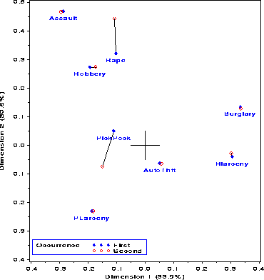
An Annotate data set LINES is then created to draw the
lines, and is appended to the ANNO=LABELS
*-- Sort crimes by upcase(_name);
data coord;
   set coord;
   _name_ = upcase(_name_);
proc sort data=coord;
   where (_type_ ^= 'INERTIA');
   by _name_ _type_;

*-- Join first/second occurrence;
data lines;
   set coord(keep=_name_ _type_ dim1 dim2);
   by _name_ _type_;
   xsys='2'; ysys='2';
   x = dim1; y = dim2;
   if first._name_
      then function='MOVE';
      else function='DRAW';

*-- Remove _type_='VAR' labels, and add lines;
data label;
   set label(where=(_type_^='VAR')) lines;
Finally, we generate AXIS statements using EQUATE, and produce the
plot
%equate(data=coord, x=dim1, y=dim2, plot=no, vaxis=axis98, haxis=axis99,
      xmextra=1, ymextra=1);

proc gplot data=coord;
   plot dim2 * dim1 = _type_
        / anno=label frame legend=legend1
          vaxis=axis98 haxis=axis99 vminor=1 hminor=1;
   symbol1 h=1.2 v=dot    c=blue;
   symbol2 h=1.2 v=circle c=red;
   legend1 position=(bottom inside left)  offset=(1,2)
        mode=share cborder=blue
        across=1 shape=symbol(6,1.5)
        label=('Occurrence') value=('First' 'Second');
run;