Gallery of Data Visualization
The Best and Worst of Statistical Graphics
but above all, data analysis involves visual, as well as statistical, understanding.
Gallery of Data Visualization
|
||
|---|---|---|
|
This page is dedicated to John W. Tukey, who taught us all
that seeing may be believing or disbelieving,
but above all, data analysis involves visual, as well as statistical, understanding. |
||
Michael Friendly
Statistical Consulting Service
and
Psychology Department
York University
This noframes version is no longer maintained
This Gallery of Data Visualization displays some examples of the
Best and Worst of Statistical
Graphics, with the view that the contrast may be useful,
inform current practice, and provide some pointers to both historical and current work.
We go from what is arguably the best statistical graphic ever drawn,
to the current record-holder for the worst.
[See the
Bad Writing Contest for examples of The Best of Bad Writing.]
Do you know of other examples of the Best or Worst in Statistical Graphics
on the Web? Let me
know through this
Image
submission form.
[Not working, sorry. Send me an email with the URL and a
brief description.]
The page is organized as a collection of images, along with a few of the 1000 words each may be worth and some links to original sources. To reduce transmission time, most of the images are presented as thumbnails, with links to larger originals. Click on the thumnail image or on the words "Full size".
|
|
|
In statistical graphics, the past is often a fountain of ideas, as rich as the future.
| Picture | Words | |||
|---|---|---|---|---|
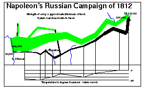
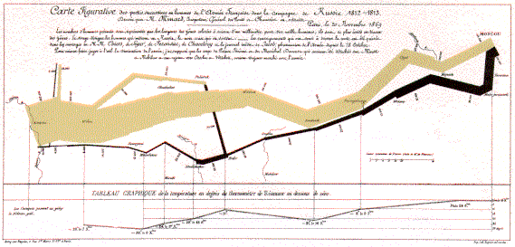
|
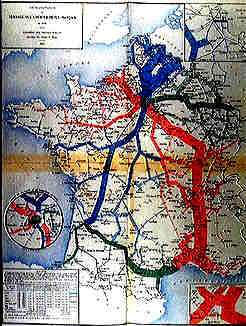
Mathematica graphic of Minard's depiction of the fate of Napoleon's army, (from Shaw & Tigg, 1993).
Full size (297x183), or see
Minard's original, Full size (569x273) [30K]
(scanned from Tufte, 1983).
The French engineer, Charles Minard (1781-1870), illustrated the disastrous result of Napoleon's failed Russian campaign of 1812. The graph shows the size of the army by the width of the band across the map of the campaign on its outward and return legs, with temperature on the retreat shown on the line graph at the bottom. Many consider Minard's original the best statistical graphic ever drawn.
The first image shown here is drawn by a Mathematica function,
|
|||
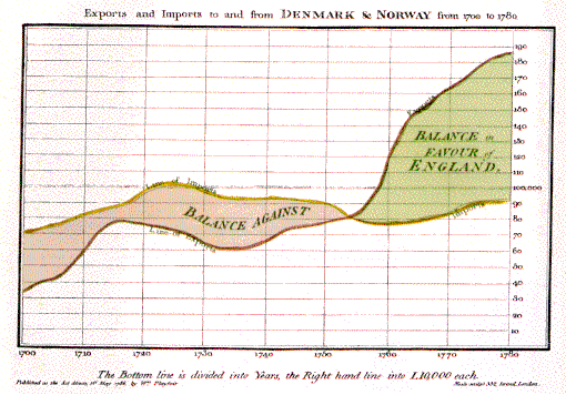
|
Playfair's charts.
(a) Balance of Trade, Full size (510x356) [41K];
(b) Prices, wages and reigns, Full size (504x267) [109K] (from Julie Scott's William Playfair page)
William Playfair (1759-1823) is generally viewed as the inventor of most of the common graphical forms used to display data: the scatterplot, line plots, bar chart and pie chart. His The Commercial and Political Atlas, published in 1786, contained a number of interesting time-series charts such as these. In the first, the area between two time-series curves was emphasized to show the difference between them, representing the balance of trade. The second graph plots three parallel time series: prices, wages, and the reigns of British kings and queens. Among the benefits of graphical display, Playfair said, "On inspecting any one of these Charts attentively, a sufficiently distinct impression will be made, to remain unimpaired for a considerable time, and the idea which does remain will be simple and complete, at once including the duration and the amount," | |||
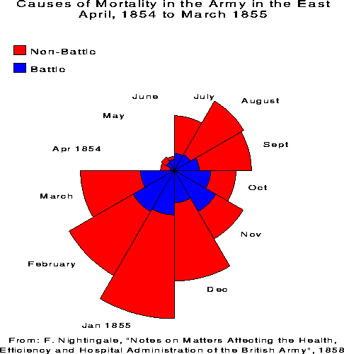 |
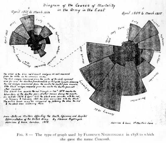
Florence Nightingale's
Coxcomb, SAS re-creation (486x501) [5K] ||
Coxcomb, original (537x462) [37K]
Florence Nightingale (image [41k])is remembered as the mother of modern nursing. But few realize that her place in history is at least partly linked to her use, following Playfair, of graphical methods to convey complex statistical information dramatically to a broad audience. After witnessing deplorable sanitary conditions in the Crimea, she wrote Notes on Matters Affecting the Health, Efficiency and Hospital Administration of the British Army (1858), including several graphs of her own design, which she called "Coxcombs". This figure (reproduced with SAS/GRAPH) makes it abundantly clear that far more deaths were attributable to non-battle causes ("preventable causes") than to battle-related causes. Aside from its historical interest, Nightingale's Coxcomb is notable for its display of frequency by area, like the pie chart. But, unlike the pie chart, the Coxcomb keeps angles constant and varies radius (proportional to sqrt(frequency)), a principle used in the FourFold Display for 2x2xk tables. See the Flo's statistical links page for further information. |
|||
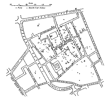 |
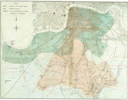
The 1854 London Cholera Epidemic.
Full size (368x320), or a better
Full size image
(90K) close-up, with greater detail
One of the first uses of a map to display epidemiological data was this dot chart (from Tufte, 1983, p. 24) by Dr. John Snow (1855) showing deaths from cholera (dots) in relation to the locations of public water pumps. Tufte says, "Snow observed that cholera occurred almost entirely among those who lived near (and drank from) the Broad Street water pump. He had the handle of the contaminated pump removed, ending the neighborhood epidemic which had taken more than 500 lives." Our Early Medical Maps page describes two other early examples of epidemiological maps, from Arthur H. Robinson's, Early Thematic Mapping in the History of Cartography: Snow's (1855) map showing the areas served by two water companies, and Perry's (1844) map of incidence of an epidemic in Glasgow (darker shading means greater incidence). John Snow (1813 - 1858) was also the first physician to practice full-time as an anesthetist. See also The Virtual Museum of Anesthesiology: John Snow |
|||
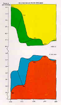
|
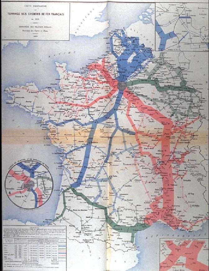
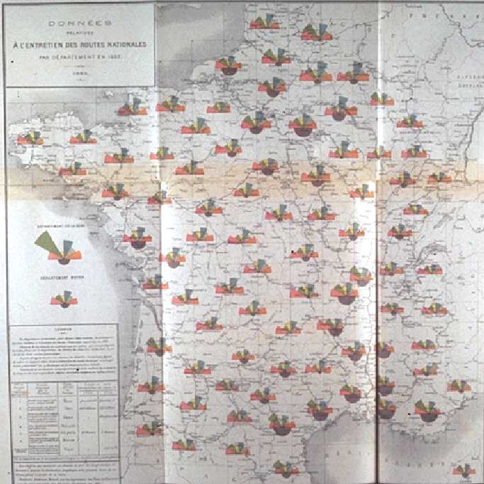
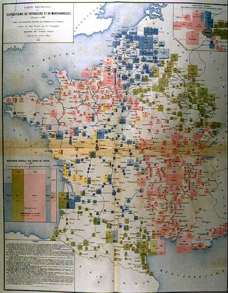
Album de statistique graphique.
larger (246x326) [19K] ||
Full page (672x871) [84K]
By the mid 1800s, many new forms of statistical graphics were being used to display data of economic and national interest in England, Framce, and elsewhere. This image, brought to my attention by Antoine de Falguerolles, is one of many beautiful statistical maps of France from the Album de statistique graphique, published annually by the Bureau de la statistique graphique of the Ministry of Public Works. from 1879 to 1899. A large-format book (about 12" by 15"), each figure folds out to four times that size, and contains exquisite detail and beautiful color tones, to which the images here cannot do justice. Many of these graphs were designed based on graphical innovations by Charles Minard, whose Napoleon's March graphic opens this Gallery. This particular flow map uses line thickness in a similar way to show the distribution of goods by rail throughout France, with different colors distinguishing different railway lines. Minard used and developed many other novel graphic forms, such as the Coxcomb (683x682) [62K] and the earliest known example [52K] of the mosaic display. See the beautiful book by Gilles Palsky, Des chiffres et des cartes, naissance et la cartographie quantitative francaise au XIXe siecle developpement (reviewed by Nicolas Verdier) for further information. | |||
See also, The Story of Moseley and X-rays. Research for this item by Abigail Friendly. |
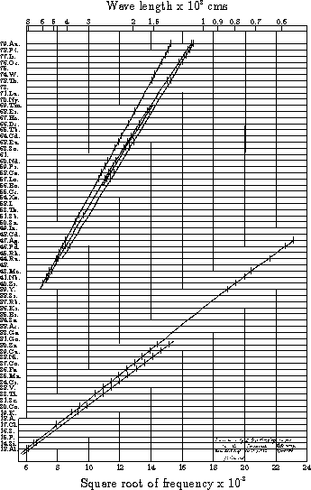
Moseley's X-rays and the concept of atomic number.
Full size (543x345) [8K] or,
scan of the original figure (986x604) [163K], from the
Philosophical Magazine, 1913, p.1024-; 1914, p. 703-.
The hallmark of good science is the discovery of laws which unify and simplify disparate findings and allow predictions of yet-unobserved events or phenomena. Mendeleev's periodic table, for example, allowed him to predict the physical and chemical characteristics of Gallium (Ga) and Germanium (Ge) before they were discovered decades later. Mendeleev's table, however, arranged the elements only by a serial number, denoting an atom's position in a list arranged by increasing atomic mass. This changed in 1913-14 when Henry Moseley investigated the characteristic frequencies of X-rays produced by bombarding each of the elements in turn by high energy electrons. He discovered, that if the serial numbers of the elements were plotted against the square root of frequencies in the X-ray spectra emitted by these elements, all the points neatly fell on a series of straight lines. "Now if either the elements were not characterized by these integers, or any mistake had been made in the order chosen or in the number of places left for unknown elements, these regularities would at once disappear. We can therefore conclude from the evidence of the X-ray spectra alone, without using any theory of atomic structure, that these integers are really characteristic of the elements." This must mean that the atomic number is more than a serial number; that it has some physical basis. Moseley proposed that the atomic number was the number of electrons in the atom of the specific element. Moseley's graph represents an outstanding piece of numerical and graphical detective work. He noted that there were slight departures from linearity which he could not explain; nor could he explain the multiple lines at the top and bottom of the figure. The explanation came later with the discovery of the spin of the electron. | |||

|
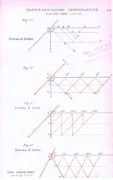
Escaping the 2D plane: The Stereogram . Full size (613x727) [105k];
Construction illustration (392x625) [35k]
By the end of the 19th century, as more statistical data became available, the limitations of 2 dimensions of the plane for the representation of data were becoming more apparent. Several systems for representing 3D data were developed between 1869-1880. This figure (showing the population of Sweden from 1750-1875 by age groups) by Luigi Perozzo, from the Annali di Statistica, 1880, (Title page (372x561) [14k]), is the first example of a stereogram that I have seen. Perozzo credits Gustav Zeuner (1869) and Lewin with the invention of the (anonometric projection) representation in three dimensions, and also describes other related forms of perspective drawings by Becker and by Lexis, shown in his construction illustration. Perozzo's figure is also notable for being printed in color in a statistics journal, and in a way which enhances the perception of depth. See Caselli & Lombardo (1990), "Graphiques et analyse démographique: quelques éléments d'histoire et d'actualité", Population 45(2), 399-414, for these and other graphical developments related to demography. Also see Stereograms : A COOL application of Geometry - Technical Explanation [Credits: Thanks to Antoine de Falguerolles for the Perozzo article, and to Gilles Palsky for correcting my historical attributions with the Caselli/Lombardo article] |
|||
|
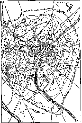
Escaping the 2D plane: The Contour plot . Full size (357x506) [16k]
Map of Paris by L. L. Vauthier (1874), showing population density
by contour lines, the first statistical use of a contour map
A second approach to representing multivariate data arose from the use of contour maps in physical geography showing surface elevation (first published in 1752 by Buache), which became common in the early 19th century. It was not until 1843, however, that this idea was applied to data, when Léon Lalanne constructed the first contour plot [11k], showing the mean temperature, by hour of the day and by month at Halle. Lalanne's data formed a regularly-spaced grid, and it was fairly easy to determine the isolines of constant temperature. Vauthier generalized the idea to three-way data with arbitrary (x,y) values in his map of the population density of Paris. Galton later cited this as one of the inspirations for his normal correlation surface. [Credits: Image: E. J. Marey (1878); Background: Palsky (1996), Beniger & Robyn (1978)] |
|||
 |
Dynamic graphics: Etienne-Jules Marey
Traces of human respiration, under normal conditions and exertion (630 x 190) [11k] ||
Chronophotography image (612 x 46) [9k]
Etienne-Jules Marey, 1830-1906, was among the pioneers of dynamic graphics and the graphical representation of movement and dynamic phenomena. This image, from Marey's La méthode graphique dans les sciences experimentales (1876, p. 150) compares the time course of respiration of a person at rest and under exertion, using a pen-recording device to plot the traces over time. Marey used and developed many devices to record and visualize motion and dynamic phenomena: walking, running, jumping, falling, of humans, horses, cats...; heart rate, pulse rate, breathing, etc. An exhibition in January, 2000 at the Fondation Electricite de France, Espace Electra (6 rue Recamier, Paris 7) is devoted to his works. The exposition web site, E. J. Marey: le mouvement en lunière is an electronic catalog worth a visit! |
 Bright ideas
| Picture | Words |
|---|---|

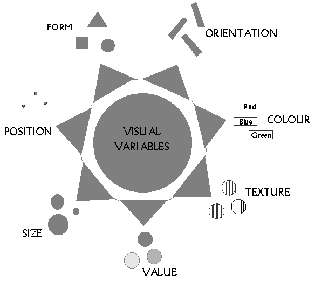
| Jacques Bertin .
Larger image (156x240)
(from Jacques Bertin, Cartographer)
No Gallery of Data Visualization can be complete without paying tribute to Jacques Bertin, whose monumental Semiology of Graphics (1983) systematically classified the use of visual elements to display data and relationships. Bertin's system consists of seven visual variables: position, form , orientation, color, texture, value, and size, combined with a visual semantics for linking data attributes to visual elements. See Colloquium on 30 years of Semiologie Graphique for a recent retrospective appreciation. |
 
| The reorderable matrix. .
Initial, unordered table (300x116) [3k]
Reordered table (300x142) [3k]
Source: Bertin (1981), Graphics and Graphic Information
Processing.
Data are often presented in a table or chart whose rows and columns are intrinsically unordered, but which are arranged in an order which conceals patterns, rather than reveal them. The top figure shows a classification of townships (columns) by binary characteristics (rows, presence or absence), both arranged in arbitrary order. Can you see any patterns or trends? One of Bertin's graphical methods consists simply of permuting the rows and columns to place similar rows and columns together. This gives the bottom figure, where now the trends are clear. |

| Boxplot of the NJ Pick-it Lottery.
Full size (640x495)
(from the S-PLUS book)
An important principle of graphical display is to focus the viewers attention on what should be seen in the data. Tukey's boxplot suppresses all detail in the middle of a distribution, but displays individual observations in the extremes, where they may need to be noticed. This boxplot shows the payoff of winning numbers in the New Jersey Pick-It Lottery, grouped by leading digit of the winning number. Players pick a 3-digit number, and the payoff is divided by the number of winners. The graph shows clearly that payoffs for numbers 000-099 are substantially higher, presumably because fewer people picked numbers less than 100. |
 |
The Bagplot: A Bivariate Boxplot. Full-size image 411x421 (4k)
From Peter Rousseeuw, Ida Ruts and John Tukey The Bagplot: A Bivariate Boxplot, Figure 1.
The univariate boxplot has been widely used since proposed by Tukey around 1971. Tukey (1975) also suggested a multivariate generalization of depth of an observation on which the boxplot is based, but no implementation of this idea had been available until quite recently. [Others had earlier suggested peeling the convex hull, but this doesn't quite get it right. Multivariate depths does, but is computationally intensive.] Peter Rousseeuw and Ida Ruts worked out the bivariate extension, called a bagplot, illustrated here. The large + marks the bivariate median. The dark inner region (the ``bag'') contains the 50% of the observations with greatest bivariate depth. The lighter surrounding ``loop'' marks the observations within the bivariate fences. Observations outside the loop are plotted individually and labeled. |

|
US Visibility Map, Full size (531 x 335)
Data maps, particularly of the United States, are difficult to do because the area of each geographic unit serves as the visual container for the data to be displayed; our visual understanding of the data is confounded with the geographic boundaries. One solution, suggested by Mark Monmonier ( How to Lie With Maps), is to use a schematic map which partially equates the areas of geographic regions. The resulting Visibility Map sacrifices some visual fidelity in state boundaries, but helps the viewer see the symbols for small states like Rhode Island and Delaware. |
 |
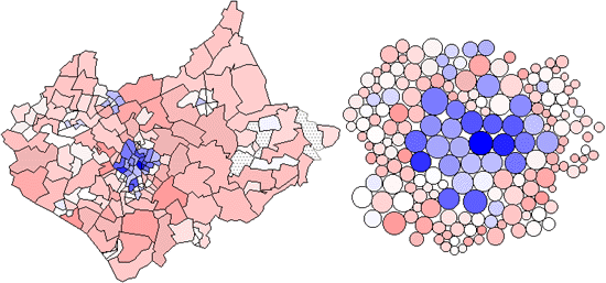
Chi-square Map.
Full size (420x348) [14K] and
with cartogram (550x257) [48K]
(from Maps of the Census: A Rough Guide, by Jason Dykes and
David Unwin)
There are many difficulties in showing rates of incidence or proportions in maps, when both the areas of geographic regions, and the populations in those regions vary, often inversely. In spatial epidemiology, for example, Standardized Mortality Ratios are often used, expressing the ratios of the number of deaths in each area to those expected on the basis of some externally specified (typically national) age-sex specific rates. This figure uses a Chi-square metric to depict the distribution of number of cars, O, in each ward in Leicestershire, UK, expressed as a signed chi-square contribution, (Oi - Ei)/ Ö Ei, relative to the expected number, E, per capita. A diverging colour scheme applies hues of red and blue to those areas with higher and lower than expected values with colour saturation showing the magnitude of the variation. Thus whiter zones are close to the expected value and deeper blues and fuller reds show the extremes. This map still confounds area and population with visual impact, which the use of a cartogram base, with circle areas proportional to the population, helps avoid. |
 |
Multivariate comparisons of means.
Full size (504x433)
It is difficult to compare the means of several groups on many variables. Profile or parallel coordinate plots are often confusing when the curves for different groups cross a great deal. The multivariate star plot shows each of an arbitrary number of variables on radial axes from the origin, here for the means of automobile models, classified by region of manufacture. In this plot, the variables Price, Gear Ratio and Turning Circle are reflected so larger values represent "better" for all variables; then all variables are first scaled to a 0-1 range. Variables are arranged around the circle by a multivariate effect ordering according to their order on the largest discriminant dimension. The error bars next to each radial axis shows the smallest value of a difference between means required for a (univariate) .05 significant difference. |
 |
Enhanced scatterplot matrices.
Full size (394x290)
The scatterplot matrix displays the relationships among all pairs of many variables. This example shows the relation among three measures of social competence, but the data in each plot are stratified by the type of setting. To aid perception of how the relations differ across setting, each subplot is enhanced with a data ellipse showing the strength of the relationship. The diagonal panels show the univariate distribution of each variable, again stratified by type of setting. Color is used effectively to keep the settings visually distinct. |
 |
Tile Maps for Temporal Patterns
Full size (469x602) [18K].
From Mintz, D., Fitz-Simons, T. & Wayland, M.
"Tracking Air Quality Trends with SAS/GRAPH",
SUGI 22 Proceedings, 807-812.
Description: The tile map is a useful semi-graphical display for data with seasonal variation. One square (tile) is plotted for each day of the year; the color of the tile shows the level of Ozone concentration in Los Angeles for that day, with lighter shades indicating lower concentration and darker shades showing higher concentrations. (Ed. note: This is true of the B/W version in the printed paper, but not true of the color version shown here, which uses 'elevation mapping' of colors to ozone concentration. The rendition in color is not exemplary.) The figure shows the data for the 10 years, 1982 - 1991. Within each year, ozone concentrations are higher in the summer months; Over years, the concentrations in the summer months have decreased. |
 |
Animated Triplot
From Graham Wills, EDV Baseball Example [Full-size image 351x554 (41k)]
Interactive visualization tools are more powerful than static graphics because they allow information in two or more displays to be "linked", so that information selected in one display is automatically selected in all others. Animation takes this idea one step further: The categories in one graph are selected cyclically, showing an additional dimension over time. This image, from Graham Wills' Exploratory Data Visualizer shows an animation of data on baseball players' fielding performance. The top panel is a triplot of the variables Errors, PutOuts, and Assists. Players who have an exactly average ratio of the three variables to each other will be drawn in the center of the triangle. If they have more of one variable, then they will be closer to that variable's corner of the triangle. The bottom panel is a bar chart coding player's fielding positions. The separation into two groups in the triplot shows that there are two different types of fielders; there is a strong distinction between fielders with many PutOuts and those with many Assists. The animation shows how the distinction depends on the player's position. |
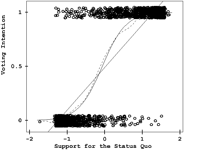 |
Discrete data. Full-size image 640x480 (6k)
From John Fox's Applied Regression Analysis, Linear Models,
and Related Methods, Figure 15.1.
Discrete, categorical data presents difficult challenges for graphical
display.
It is hard to show the data, because many points coincide
This graph shows a scatterplot of data from a survey of Chilean voters held six months before the plebicite held in September 1988 on the future of the military government of Augusto Pinochet. The ordinate, "Voting Intention" is a binary variable, 0 = No = Return to Civilian government, 1 = Yes = Continue Military rule. The abscissa reflects a scale of Support for the Status Quo. The graph shows the binary observations at the top and bottom of the display, jittered vertically to avoid overplotting. The solid line is a linear regression; the solid curve is a logistic regression. A non-parametric (lowess) curve is shown by the broken line. Although there is no data in the middle of the graph, the visual elements combine to show how the propensity to vote Yes increases steadily with Support for the status quo. |
| Picture | Words |
|---|---|
|
Turning Tables into Graphs Full size (441x721) PostScript image
Complex, high-dimensional data present special challenges to graphical display. Dan Carr describes the construction of this graph in the Statistical Computing and Graphics Newsletter, V6(3) [v63.ps.gz] of the ASA Statistical Computing and Graphics Section . Carr says: A little effort went into splitting the data set into cells, some went into making a function to plot the data in a cell, and a great deal of effort went into attending to details |

|
Steve Majewski's Boxplot.
Full size (465 x 300) [6k]
(Links to LispStat code and other examples here)
Description: The graph represents elemental concentrations of Calcium derived from least squares fit of filtered X-ray Energy Spectra - measurements taken from Cytoplasm, Mitochondria, and over the whole cell from treated and control samples. The data points are printed with jittered/randomized X coordinates, to keep them from overprinting and obscuring each other. The boxes are "standard" boxplots (using a modification of the standard XlispStat boxplot function) showing the median value, boxing the inner quartiles, and showing the max and min range. The white and gray ovals are centered around the weighted means of the data, with the vertical radius being one and two standard deviations, respectively. The thin gray horizontal line is the mean of the combined data. |

|
Trellis plot of Barley data
Full size (384 x 987) [15k]
Description: The figure is a Trellis display of data from an agricultural field trial of barley yields at six sites in Minnesota; ten varieties of barley were grown in each of two years. The data were presented by R. A. Fisher in The Design of Experiments and analyzed subsequently by many others. William Cleveland's display of these data shows an apparent surprise missed by previous investigators, which occurs at the Morris site: For all other sites, 1931 produced a significantly higher overall yield than 1932. The reverse is true at Morris. But most importantly, the amount by which 1932 exceeds 1931 at Morris is similar to the amounts by which 1931 exceeds 1932 at the other sites. More displays, a statistical modeling of the data, and some background checks on the experiment led to the conclusion that the data are in error -- the years for Morris were inadvertently reversed. The background of the data, and analysis with Trellis are described in more detail in these Case Studies and (in PostScript format) in The Visual Design and Control of Trellis Display The graph uses main effect ordering to arrange the 6 sites and 10 barley varieties from bottom to top according to increasing values of the median yields (collapsed over other factors). This greatly aids perception of trends in the data and makes the Morris data stand out as unusual. |
| Picture | Words |
|---|---|
 |
Atlas of Cyberspaces:
Mapuccino, Java display of web site structure full size (1024 x 768) [29K]
Mapping and the visual representation of information structure has been challenged by the World Wide Web and other emerging Cyberspaces. The Atlas of Cyberspaces project at University College, London provides a visual atlas of maps and graphic representations of the geographies of new electronic territories on the Internet. This image, from the Web Site Maps page shows a fish-eye view of a web site map constructed dynamically by Mapuccino, a Java application for interactive visual maps of Web sites developed by the IBM's Haifa Research Lab in Israel. |
 |
Cartes Gastronomiques:
Bread map of France, full size (594 x 554) [79K]
Cheese map of France, full size (599 x 540) [69K]
Not all thematic maps have to have a serious purpose. Cartes gastronomiques were quite common in the early 20th century and many fine examples are held in the Bibliotheque Nationale. I found these examples in a brochure distributed by Coté France on the Autoroute du Sud. Now, what's the shortest distance between a Cantal and a pain de mie?. |
 |
Math Flavored Amusements
A collection of visual delights from Jack Siler at University of Pennsylvania, candy for the mathematical eye. Links to lovely collections of math art, fractal images, computational geometry, mathematical visualizations, etc. |
|
Wallpaper Groups
A collection of graphics illustrating the 17 plane symmetry groups with wallpaper patterns, by David Joyce at Clark University. See also: Symmetry and the Shape of Space by Chaim Goodman-Strauss. Xah Lee's Tilings and Patterns site contains a large collection of wallpaper designs based on geometrical motifs, Mathematica software, and links to many other related sites. Mark Phillips' Java Kali lets you draw wallpaper patterns based on any of the 17 plane symmetry groups. | |

|
The KnotPlot Site
A collection of knots and links by Robert Scharein at UBC, viewed from a (partly) mathematical perspective. The images were created with KnotPlot, a program to visualize and manipulate mathematical knots in three and four dimensions. |

|
Totally Tesselated
A site devoted to tesselated designs -- space-filling, repetitive pattersn in art and mathematics including some history, mosaics and tilings, Escher, and more. |
| Picture | Words |
|---|---|

|
The Lie Factor.
Full size
(from Tufte, 1983, p.57); gif image by Clay Helberg, Pitfalls of Data
Analysis
This graph, from the NY Times, purports to show the mandated fuel economy standards set by the US Department of Transportation. The standard required an increase in mileage from 18 to 27.5, an increase of 53%. The magnitude of increase shown in the graph is 783%, for a whopping lie factor = (783/53) = 14.8! |

|
The Lie Factor.
Full size
(from Tufte, 1983, p.69)
Another key element in making informative graphs is to avoid confounding design variation with data variation. This means that changes in the scale of the graphic should always correspond to changes in the data being represented. This graph violates that principle by using area to show one-dimensional data, giving a lie factor = 2.8. |
|
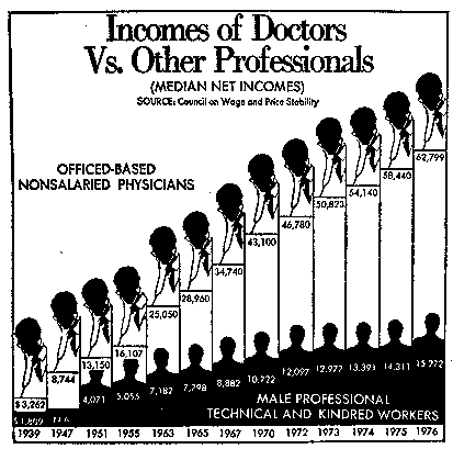
Rubber-band Scales.
Full size (413 x 409) [10k]
(from Wainer, 1997, p.29)
A less obvious (and therefore more insideous) way to create a false impression is to change scales part way through an axis. This graph, originally from the Washington Post purports to compare the income of doctors to other professionals from 1939--1976. It surely conveys the impression that doctors incomes increased about linearly, with some slowing down in the later years. But, the years have large gaps at the beginning, and go to yearly values at the end. If you are going to use rubber-band scales, try to make the axis values small and visually indistinct, as this graphic sinner did! |
|
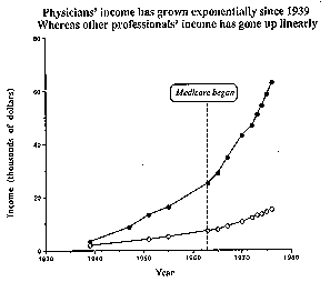
Rubber-band Scales - Unstretched.
Full size (297 x 254) [2k]
(from Wainer, 1997, p.30)
A re-drawing of the graph, with year values spaced appropriately, gives an entirely different message -- doctors income now appears to have increased exponentially, while the incomes of other professionals seems to have increased linearly. The annotation of the date when medicare began suggests another interpretation -- linear increase, but with two differnt slopes before and after the implementation of the medicare system. We can think about these competing models of the data now that the data are portrayed fairly. |
| Picture | Words |
|---|---|
|
Goosed-up Graphs.
Full size (403 x 480) [2k]
(from Gould, Full House (1996), p.109, fig 16)
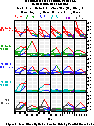
It is always distressing when one of your heros commits a graphical sin, even more so when that sin (if only venal) was unnecessary (like stealing candy when you have plenty at home), and the argument would have carried the day without it. Stephen Jay Gould argues forcefully in Full House that the absense of 0.400 hitting in baseball since Ted Williams' 0.406 season in 1941 has more to do with a decrease in variability among players than with any decline in overall performance in batters, or increase in the opposition (fielding, pitching, etc). He presents this graph to show---as anyone who is not blind can see-- that the standard deviation of batting averages has declined regularly and precipitously over the history of major league baseball. There are several problems with this graph, but the sin is that it has beeen formatted to present the decline in variability in the most goosed-up way. First, the XY axes have been interchanged, permitting a portrait-shaped graph to show a steeply negative slope. Second, the range of the horizontal axis (standard deviation) has been limited to make the slope as steep as possible. |
|
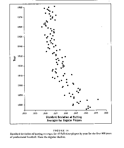
... de-Goosed.
Full size (480 x 403) [2k]
(from Gould, Full House (1996), p.109, fig 16, transposed)
The graph should be re-designed, but a fairer representation of the change in standard deviations of batting averages over time is obtained simply by flipping the graph about a 45o diagonal, placing Year on the horizontal axis. We still see a decline in variability of batting averages over time, but not nearly as dramatic as in the original graph. We also see (if we can read mirror-writing) that the greatest decline in variability occurred between 1880--1910. After 1910, there has been some decline, but only enough to excite the sabermetrician of 3rd decimal places. |
| Picture | Words |
|---|---|
|
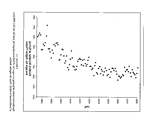
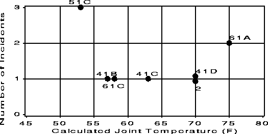
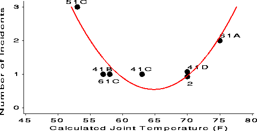
The Challenger Disaster Full size (451x228) [3K].
The Space Shuttle Challenger exploded shortly after take-off in January 1986. Subsequent investigation determined that the cause was failure of the O-ring seals used to isolate the fuel supply from burning gases. This figure (scanned badly from Wainer, 1995) shows a graph accompanying the Report of the Presidential Commission on the Space Shuttle Challenger Accident, 1986 (vol 1, p. 145) in the aftermath of the disaster. NASA staff had analysed the data on the relation between ambient temperature and number of O-ring failures (out of 6), but they had excluded observations where no O-rings failed, believing that they were uninformative. Unfortunately, those observations had occurred when the launch temperature was relatively warm (65-80 degF). |
|
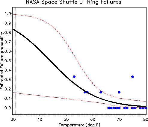
The Challenger Disaster Full size (494x424)[4K].
Reanalysis of the O-ring data involved fitting a logistic regression model. This provides a predicted extrapolation (black curve) of the probability of failure to the low (31 degF) temperature at the time of the launch and confidence bands on that extrapolation (red curves). See also Tappin, L. (1994). "Analyzing data relating to the Challenger disaster". Mathematics Teacher, 87, 423-426 There's not much data at low temperatures (the confidence band is quite wide), but the predicted probability of failure is uncomfortably high. Would you take a ride on Challenger when the weather is cold? See also: Gary McClelland's Graphs on the Web: Challenger Story, with a Java applet |
|
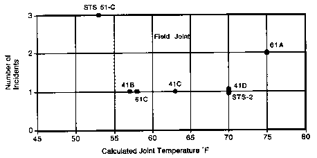
But, what if they had made a better graph?
Initial graph, full size (525x263)[4K];
Re-designed graph, full size (525x269)[4K].
The original graph was prepared by engineers from the contractor, Morton Thiokol, and it is perhaps unreasonable to expect that a sophistocated statistical analysis of the data should have been carried out, given the time pressure for a launch / no-launch decision.
Nevertheless, it is of interest to ask whether a re-design of the original
graph might have signalled that something was amiss. Apart from the
disasterous blunder of omitting the observations with 0 failures,
two steps, |
When the goal of a graph is to allow comparison, or show the difference between circumstances, the question to ask is, Compared to what?.
| Picture | Words |
|---|---|
 |
Display data in the proper context
Full size
(412x374) [10K] (from Tufte, 1983, p. 74)
Does stricter enforcement of speed limits lead to a decline in trafic fatalities? You surely can't tell from this graph. What does it mean to show a decline in traffic fatalities over two years? What was the trend before the change in enforcement? after? Failure to show the relevant context produces a thoroughly misleading display. |
 |
... That context tells a different story
Full size
(412x333) [8K] (from Tufte, 1983, p. 74)
Now we can see that there must be some other important factors other than stricter enforcement.. This information would be completely missed if all you had to look at was the former graph. |
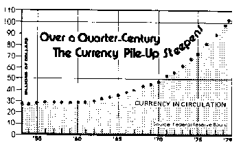 |
The Great Currency Mountain
Full size (354 x 217) [4K]
(From A.J. Jaffe & H. F. Spirer, Misused Statistics, p. 77)
A Wall Street Journal article displays this graph in an article headlined "Americans hold increasing amounts of cash despite inflation and many other drawbacks". Unfortunately, the data plotted has not been adjusted for inflation. |
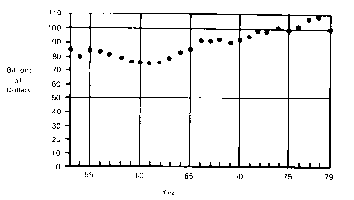 |
... Cut Down to Size
Full size(354 x 200) [2K]
Redrawn, adjusting for inflation. We now see that there has been a slight rise in the anount of currency in circulation, but hardly anything to get excited about. What else has not been adjusted for? |
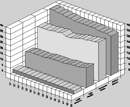 |
Who's on First?
Full size (453 x 372)[11K]
This graph, from Citation Data Reveal World Rankings Of Scientific Papers is summarized by the following: European Union (EU) scientists now publish about as many papers as scientists from the United States, according to a new survey conducted by Science Watch. During the past 16 years, the EU's share of research papers increased from 30.5 percent to 36.2 per cent, while the U.S. share fell from 40.5 percent to 36.5 percent. .... As the graph shows, the EU increase and the U.S. decline have now reached a point of intersection, with the U.S. share of the world's total research papers currently exceeding Europe by only a few tenths of a percent.Unfortunately, the 3D "wall graph", even with reference lines across the back, is a poor choice for making comparisons of this kind. A simple line graph would be much better, since comparisons between regions would be direct. Beyond this, the question, "Compared to What?" arises here, as well. The article does mention that membership in the EU rose from 10 countries in 1981 to 15 in 1995, but this is not accounted for in the graph. |
|
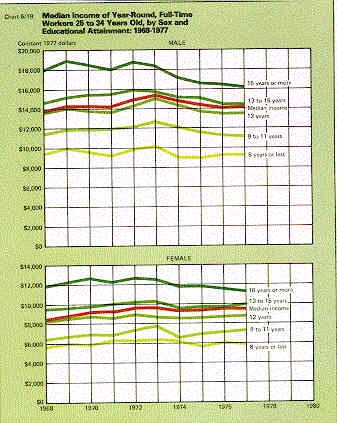
Emphasize trivial comparisons.
Full size (330 x 415) [27k]
(from Wainer, 1997, p.31)
Finally, it is easy to avoid the important, useful or relevant comparisons by separating them visually, or making trivial relations more prominant. This graph, originally from Social Indicators III purports to compare trends in the median income of men and women by levels of education. But stacking the graphs for men and women vertically hides the large gender difference in incomes, while emphasizing the obvious result that higher education leads to greater income. Stretching out the horizontal scale also helps to hide any trends over times. |
|
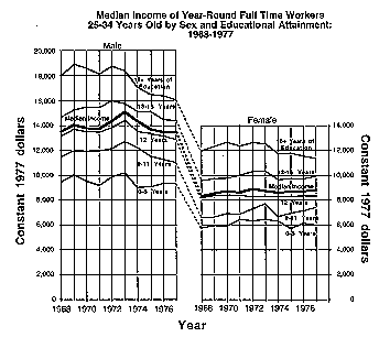
... re-designed.
Full size (344 x 306) [6k]
(from Wainer, 1997, p.31)
The vertical scales of income for men and women may be directly compared simply by arranging the plots horizontally. Connecting corresponding curves in the two panels helps to show the difference at the same level of education. Time trens are also made more apparent by compressing the horizontal axis in each plot. [This plot would be even better if the background grid was lighened or eliminated.]
|
|
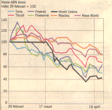
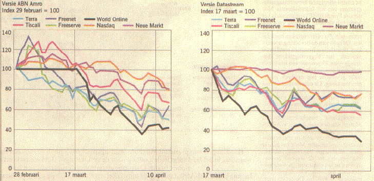
Shifting the sands of time.
Full size (361 x 353) [43k]
Both images, full size (729 x 353) [83k]
(from NRC Handelsblad, May 27,
2000)
Index numbers are widely used to standardize a time series to a given date so that trends may be compared more easily, as in the consumer price index. Skillful manipulation of the base date and the axes, however, may be used by the unfair-minded to enhance or suppress differences between different series. Here is a lovely and compelling example of How to Lie with Graphs from Niels H. Veldhuijzen. This graph appeared in connection with the recent debacle of the Dutch internet provider World On Line (WOL), which sought a stock market quotation on the Amsterdam Stock Exchange. The stock prices went to nearly zero within a day! The Dutch bank (ABN AMRO), leader of the syndicate responsible for the quotation, said: "We could not foresee this. Many other funds were in a downfall too; some of them more than WOL." The bank illustrated this by a graph with index numbers. Note that the chart starts at February 28. WOL (the black line) doesn't look too bad, compared with the other time series. |
|
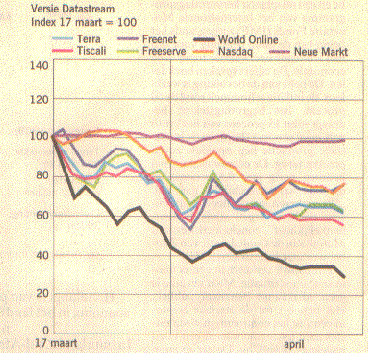
... Unhifting the sands of time.
Full size (361 x 353) [43k]
Both images, full size (729 x 353) [83k]
WHOA!! -- why is that black line for WOL flat at 100 from Feb 28 to March 17? Well, the stock market quotation of WOL didn't occur until March 17! Unhifting the base date for the index numbers to March 17 give this graph, in which WOL appears to be very quickly heading down the toilet. [Credits: Niels H. Veldhuijzen provided these graphs, and most of the accompanying text. He says: "How to lie with statistics [by Darrell Huff] may be fifty years old (still in print!), but people never learn." Well, maybe they did!] |
| Picture | Words |
|---|---|
|
Art or Artifice? Full size (197x336) [6K].
As a substitute for substance, one can try lots of color, 3D effects, or disguised redundancy. This graph uses all three techniques, to display just five numbers. Note the clever use of mirror-imaging -- the top series is just (100 - the bottom series) and the interesting use curved lines, front and back to avoid the appearance that there's a lot less here than meets the eye. Tufte (1983, p.118) says, "This may well be the worst graphic ever to find its way into print." |

![Florence Nightingale (image [41k])](images/portraits/nightingale.jpg)
![the first contour plot [11k]](images/palsky/lalanne.gif)
![full size (599 x 540) [69K]](images/cheese.jpg)