Background

We recently discovered a remarkable and little known graph portraying the deaths among passengers and crew on the maiden (and only) voyage of the RMS Titanic. This was published in the London illustrated newspaper, The Sphere, on May 4, 1912, less than one month after the ship sank. PDF of Sphere graph

We decided to track down and catalog the wide variety of graphs and statistical methods used to display and analyse the data related to this disaster. This material was first reported at Compstat 2018 in Symanzik, Friendly, and Onder (2018).

This web page is meant as a supplement to presentations and papers that explain the context in more detail, but for which there was insufficient space for all illustrations that might be of interest. More importantly, it collects the wide variety of images, sources, and references we have found dealing with the Titanic data.

Our paper in the JSM 2019 proceedings gives a variety of additional data sources and other graph examples not reported earlier. All our references are contained in titanic.bib

A small experiment

A reader of the Significance paper complained that we had “oversold” what could be seen in Bron’s graph.

“Just a glance showed that, overall, two-thirds of the passengers and crew perished.” That must have been some glance to be so precise.

To check this assertion, we carried out a small experiment in graphical estimation in two classes: one a mixed undergraduate and graduate student Statistical Visualization II course at Utah State University (n=10); the other a graduate course, Psychology of Data Visualization at York University (n=7).

Under the same conditions, we gave the following instructions and asked for a visual assessment of the fraction of Titanic passengers & crew who died. Bron’s graph was then displayed for 20 seconds. The exact instructions were:

Forget everything you may know about survival on board of the HMS Titanic. Rather take a careful look at G. Bron’s graph. Note that Black indicates passengers and crew NOT SAVED (died) and White indicates the SAVED (lived). Then complete the following sentence: Overall, about ________ of the passengers and crew died, i.e., were NOT SAVED. Fill in a simple fraction such as 1/10, 1/8, 1/4, 1/3, 2/5, 1/2, ., 7/8, 9/10 (but do not sum up the numbers for a precise fraction such as 1234/2345).

The correct answer from Bron’s graph is quite close to our statement of “two-thirds”:

(died.percent.Bron <- (1347 + 103 + 53) / (1347 + 103 + 53 + 315 + 336 + 52))
## [1] 0.6813237

In the results, we found a few outliers and some differences between the two groups, shown in the boxplot below, where the green horizontal line shows the exact percentage. Individual responses, reported as fractions, are shown as grey jittered dots.

One obvious outlier, a value of 1/3, is most likely a misunderstanding of black (died) vs. white (lived). In general, most viewers were reasonably close to the true percentage, 68.1 from Bron’s chart, close enough to our statement of “two-thirds”.

G. Bron

G. Bron was a prolific technical illustrator who worked for The Sphere and other similar publications about 1910–1925. Little about him was known, not even his first name.

Here are some of his other graphic works we have discovered. Click on the thumbnail to see a full size image.

G. Bron, aka George Treeby or William Brown Treeby

As far as we can determine, G. Bron was the pseudonym used by a graphic artist, illustrator and cartoonist named either George Treeby or William Brown Treeby. The only reliable information we have found connecting “G. Bron” with these other names comes from Australian sources. See his biography in Design and Art Australia, which describes him as a “Federation-era Melbourne magazine cartoonist, illustrator and writer. Treeby contributed drawings to the Bulletin and Melbourne Punch as well as contributing articles to Lone Hand.”

The portrait below appeared in the Trove, January 14, 1909 and contains a sketch of a biography.

By his own account:

I was born in London, and brought to Australia by adventurous parents in infancy. Shirking real graft, I suffered an apprenticeship to the unreasonable occupation of wood-engraving, which was wearing to the eyes but good for the patience.

Tripped it to England (I, not Job) with wife and young family, and stopped there five years, it being while working in London, half engraver, half artist, that the name ‘G. Bron’ was invented– duplication that I sometimes would like to send to pot.

Some evidence for George Treeby comes from the Personal section of The Feilding Star, Volume XI, Issue 2391, 10 July 1914:

Victoria has become notable for the number of its literary and artistic, families– the Lindseys, the Dysons, the McCraes, the O’Farrells, and the Treebys. The last-named family, which is now settled in London, consists of three artists and one writer, all of whom are well known in Australia. Mr George Treeby, the father, who draws for the Sydney Bulletin under the name of “G. Bron,” has contributed to the Illustrated London News and Graphic, but now devotes all his time to The Sphere. …

The evidence for William Brown Treeby comes from the Trove, January 14, 1909 article.

Data sources

Here we give references to various sources and data sets on the Titanic.

Primary sources

Data sets

The Titanic data first appeared as a real data set (cases by variables) in connection with a Journal of Statistics Education article (Dawson 1995). A variety of other forms and versions are available in R packages and other online sources.

  • Dawson, The “Unusual Episode” Data Revisited: Titanic Data; there is also the codebook and variable description.

  • R data sets: As of September 2019, there exist at least 12 different R packages with a total of 17 different Titanic data sets. Their names and characteristics are given in the JSM 2019 proceedings article. These are given in the form package::dataset. In R, use help(package::dataset) for a description of the contents. A few of these data sets are listed below as examples:
    • datasets::Titanic (a \(4 \times 2 \times 2 \times 2\) table)
    • carData::TitanicSurvival (a ‘data.frame’: 1309 obs. of 4 variables)
    • COUNT::titanic, COUNT::titanicgrp: Data sets from Hilbe(2011, 2014)
    • rpart.plot::ptitanic (a ‘data.frame’: 1309 obs. of 6 variables:)
  • Kaggle competition: Rebecca Bilbro: https://github.com/rebeccabilbro/titanic. Details on 1309 passengers on the Titanic.

Variations

The attentive reader will note that there are differences, mostly small, among the various sources that have been used in accounts of the Titanic disaster. Below are some observations on the history of this data set.

  • The legend in G. Bron’s chart gives the tables below containing the numbers plotted in the bars. From his data, there were 1318 passengers and 898 crew carried, for a total of 2206. Of these, 493 passengers and 210 crew were saved, giving a total of 703 survivors.

  • Dawson (1995) described his attempts to compile the data set of passengers and crew from various sources. In the end, his data set consisted of 2201 observations: 1316 passengers and 885 crew. These are the data used in the R data set, datasets::Titanic
addmargins(margin.table(datasets::Titanic, c(1,4)))
##       Survived
## Class    No  Yes  Sum
##   1st   122  203  325
##   2nd   167  118  285
##   3rd   528  178  706
##   Crew  673  212  885
##   Sum  1490  711 2201
  • As noted above, most data sets listing individual passengers and their characteristics give the total number of passengers as 1309. Some of these give further details (passenger name, family composition, price of ticket, etc.)
addmargins(table(carData::TitanicSurvival$survived))
## 
##   no  yes  Sum 
##  809  500 1309

Modern graphs and uses

After Bron’s remarkable work, many graphical methods have been used to tell the Titanic story as well as to illustrate some new methodologies. This section gives some representative examples of the various graphical methods and uses for the Titanic data.

Bar charts

As in Bron’s chart, the Titanic data is most easily displayed in bar charts. Modern uses have focused on extending this in various ways.

As one example, Hofmann (1998) use this data set to illustrate interactive methods for analyzing multivariate contingency tables. The figure below shows the univariate breakdowns by Class, Sex, Age and Survive. Selecting Survive=Yes highlights these cases in all other plots.

Parallel sets

Parallel coordinate plots provide a way to display multidimensional data in 2D plots. They do this by representing the variables as a set of parallel axes, and showing each observation as a line in parallel coordinate space, rather than as a point in standard coordinate space.

Extensions of this idea for categorical data led to “parallel sets plots”, and some variations, a number of which use the Titanic data for examples.

Tree diagrams

Cross-classified data can also be displayed as tree diagrams of various types, with branches corresponding to splits of the categories for variables in some order. Treemaps (Shneiderman 1992) are a simple example, similar to mosaic plots.

A more powerful use arises in connection with classification trees as models for an outcome variable such as survival. For a binary response, these are similar to a series of logistic regression models, where predictors are chosen to maximize predictive accuracy at each step. Pruning methods and cross-validation are used to control model complexity and minimize out-of-sample classification error. Varian (2014) was among the first to use the Titanic data for this purpose.

The figure below gives the result of fitting a conditional inference tree (“ctree”) predicting survival from sex, class, age and a measure of family size (sibsp = number of siblings plus spouse aboard). The first node splits the data by sex. The second divides by class. Among males in the right branch a third node splits by age, and those less than 9 years old are further split by sibsp. The bars at the bottom show the survival rate in each terminal node.

Lifeboats data

The Titanic sailed with only enough lifeboat space for half the people on board, the result of an antiquated safety code that hadn’t kept pace with the growing size of ocean liners. Yet some of those lifeboats were lowered less than half full.

Bron tried to illustrate what he knew at the time, but the actual data (vcd::Lifeboats) allowed a richer story to be told with modern graphical and statistical methods.

  • Friendly (2000), SUGI 25, Lifeboats on the Titanic shown as trilinear plots. Plotting the proportion of women & children in the the boats against time of launch revealed a striking difference in the regimes of loading on the port and starboard sides.

  • Friendly and Meyer (2016) Discrete Data Analysis used other plots to examine the loading of the lifeboats over time.

Miscellaneous data graphs

The Titanic data also served to motivate or illustrate a wide variety of other graphical and analytic methods.

Logistic regression: Dot plots, nonparametric smooths

  • Harrell (2015) and others use the data on the passengers in a modeling approach to predict survival from the available predictors, using logistic regression for the binary outcome (survived/died). This leads to interesting plots showing the actual or predicted probability of survival in relation to several factors simultaneously.

A dot plot summarizes the probability of survival for the predictors

Nonparametric regression smooths show the relation of survival to passenger class and sex. Note “Women and children first” does not apply so well in 3rd class.

Nomograms

Balloon plots

  • Jain and Warnes (2006) coined this term to refer to a semi-graphic table, in which the size of the cell entry was overlaid with a “balloon” to show the magnitude.

Venn and Euler diagrams

Educational uses

  • Dawson (1995) JSE, 1995 used the Titanic data, without identifying it as such in a classroom exercise in statistical thinking: Given tables of the data on survival by class, age, gender, could students discover what the “Unusual episode” entailed?

  • Schumm et al. (2002), Teaching Sociology, 2002: Classroom use to illustrate the impact of social class.

Textbooks with Titanic-based exercises and case studies

Info Vis applications

Just as the tragedy of the sinking of the Titanic inspired Bron to try to put the data into visual form, so too this event has been a challenge for modern graphic designers to tell the story of this disaster in ways that are both visually appealing and provide sufficient details. Unlike statistical graphs which usually focus on just one aspect, an information graphic often tries to tell the entire story all on one sheet, as in a poster presentation.

This one is a tour-de-force of visual story-telling.

Competitions

There have been several recent competitions to use the Titanic data with modern statistical techniques and graphic methods. Here are a few highlights.

Kaggle

The Kaggle competition, Titanic: Machine Learning from Disaster was designed as a competion in predictive modeling, using the Titanic data. The data set was split into training and test samples. The goal was to devise a method to predict survival in the test sample, using only the training data set. This competition attracted nearly 10,000 teams, submitting their code, results and commentary.

Here are just a few notable entries:

Business Analysis Olympiad

Business Analysis Olympiad: The city of Charlotte, North Carolina, sponsored a Business Analysis Olympiad to promote the business value of using visual data analysis software in 2008. The competition was based on Titanic data and it attracted teams from across the city’s 14 departments to learn about the new ways how to visualize and analyze this data set. Teams analyzed and visualized many aspects of the data set including the empty spaces in the lifeboats, and the origin and destination of the passengers.

Immortal Data

While the sinking of the Titanic is not the largest maritime disaster with respect to the number of lives lost, it is one of the most memorable ones because of the detailed data on lives lost (and not-lost) that have been made available and its huge influence on pop culture via books, movies, TV documentaries, and Titanic-inspired exhibits and museums. However, one reason for the longevity and popularity of this data set is that it gives authors a concrete topic and data set to use to discuss more general social issues.

References

Agresti, Alan. 2007. “An Introduction to Categorical Data Analysis.”

Barr, Andrew, and Richard Johnson. 2017. “Titanic.” National Post, online, April 24. https://nationalpost.com/news/graphics/titanic-anniversary-who-was-on-the-ship-when-it-sunk-and-who-got-away.

Bendix, Fabian, Robert Kosara, and Helwig Hauser. 2005. “Parallel Sets: Visual Analysis of Categorical Data.” In INFOVIS 2005. IEEE Symposium on Information Visualization, 133–40. IEEE.

Bernard, Jürgen, Martin Steiger, Sven Widmer, Hendrik Lücke-Tieke, Thorsten May, and Jörn Kohlhammer. 2014. “Visual-Interactive Exploration of Interesting Multivariate Relations in Mixed Research Data Sets.” In Computer Graphics Forum, 33:291–300. 3. Wiley Online Library.

Brath, Richard. 2012. “Multi–Attribute Glyphs on Venn and Euler Diagrams to Represent Data and Aid Visual Decoding.” In Proceedings of the 3rd International Workshop on Euler Diagrams, 122–29. University of Brighton, UK; University of Kent, UK.

———. 2018. “Text in Visualization: Extending the Visualization Design Space.” PhD thesis, London South Bank University.

Dawson, Robert J. MacG. 1995. “The ‘Unusual Episode’ Data Revisited.” Journal of Statistics Education 3 (3). http: //www. stat.ncsu.edu/info/jse/v3n3/datasets.dawson.html.

Drucker, Steven, and Roland Fernandez. 2015. “A Unifying Framework for Animated and Interactive Unit Visualizations.” Microsoft Research. https://www.microsoft.com/en-us/research/publication/a-unifying-framework-for-animated-and-interactive-unit-visualizations/.

Friendly, Michael. 1994. “Mosaic Displays for Multi-Way Contingency Tables.” Journal of the American Statistical Association 89: 190–200. http://www.jstor.org/stable/2291215.

———. 1999. “Extending Mosaic Displays: Marginal, Conditional, and Partial Views of Categorical Data.” Journal of Computational and Graphical Statistics 8 (3): 373–95. http://datavis.ca/papers/drew/drew.pdf.

———. 2000. “Visualizing Categorical Data: Data, Stories and Pictures.” In Sugi, 25:889–97. pub-sas. http://datavis.ca/papers/sugi/vcdstory/vcdstory.pdf.

Friendly, Michael, and David Meyer. 2016. Discrete Data Analysis with R: Visualization and Modeling Techniques for Categorical and Count Data. Boca Raton, FL: Chapman & Hall/CRC. http://ddar.datavis.ca.

Friendly, Michael, Juergen Symanzik, and Ortac Onder. 2019. “Visualising the Titanic Disaster.” Significance 16 (1): 14–19. https://doi.org/10.1111/j.1740-9713.2019.01229.x.

Harrell, F.E. 2015. Regression Modeling Strategies: With Applications to Linear Models, Logistic and Ordinal Regression, and Survival Analysis. 2nd ed. Springer Series in Statistics. Springer International Publishing. https://books.google.ca/books?id=94RgCgAAQBAJ.

Hartigan, J. A., and B. Kleiner. 1981. “Mosaics for Contingency Tables.” In Computer Science and Statistics: Proceedings of the 13th Symposium on the Interface, edited by W. F. Eddy, 268–73. New York, NY: Springer-Verlag.

Hofmann, Heike. 1998. “Simpson on Board the Titanic? Interactive Methods for Dealing with Multivariate Categorical Data.” Statistical Computing & Statistical Graphics Newsletter 9 (2): 16–19.

———. 2001. “Generalized Odds Ratios for Visual Modeling.” Journal of Computational and Graphical Statistics 10 (4): 628–40. http://www.jstor.org/stable/1390963.

Hofmann, Heike, and Marie Vendettuoli. 2013. “Common Angle Plots as Perception-True Visualizations of Categorical Associations.” IEEE Transactions on Visualization and Computer Graphics 19 (12): 2297–2305. https://doi.org/http://doi.ieeecomputersociety.org/10.1109/TVCG.2013.140.

Jain, Nitin, and Gregory R Warnes. 2006. “Balloon Plot.” The Newsletter of the R Project Volume 6/2, May 2006, 35.

Jewell, P. Nicholas. 2003. Statistics for Epidemiology. CHAPMAN & HALL/CRC.

Langer, Julia, and Michael Zeiller. 2017. “Evaluation of the User Experience of Interactive Infographics in Online Newspapers.” In. Forum Media Technology.

Meyer, David, Achim Zeileis, and Kurt Hornik. 2006. “The Strucplot Framework: Visualizing Multi-Way Contingency Tables with Vcd.” Journal of Statistical Software 17 (3): 1–48. http://www.jstatsoft.org/v17/i03/.

Možina, Martin, Janez Demšar, Michael Kattan, and Blaž Zupan. 2004. “Nomograms for Visualization of Naive Bayesian Classifier.” In European Conference on Principles of Data Mining and Knowledge Discovery, 337–48. Springer.

Schumm, Walter R, Farrell J Webb, Carlos S Castelo, Cynthia G Akagi, Erick J Jensen, Rose M Ditto, Elaine Spencer-Carver, and Beverlyn F Brown. 2002. “Enhancing Learning in Statistics Classes Through the Use of Concrete Historical Examples: The Space Shuttle Challenger, Pearl Harbor, and the Rms Titanic.” Teaching Sociology 30 (3): 361–75.

Shneiderman, B. 1992. “Tree Visualization with Treemaps: A 2-D Space-Filling Approach.” ACM Transactions on Graphics 11 (1): 92–99.

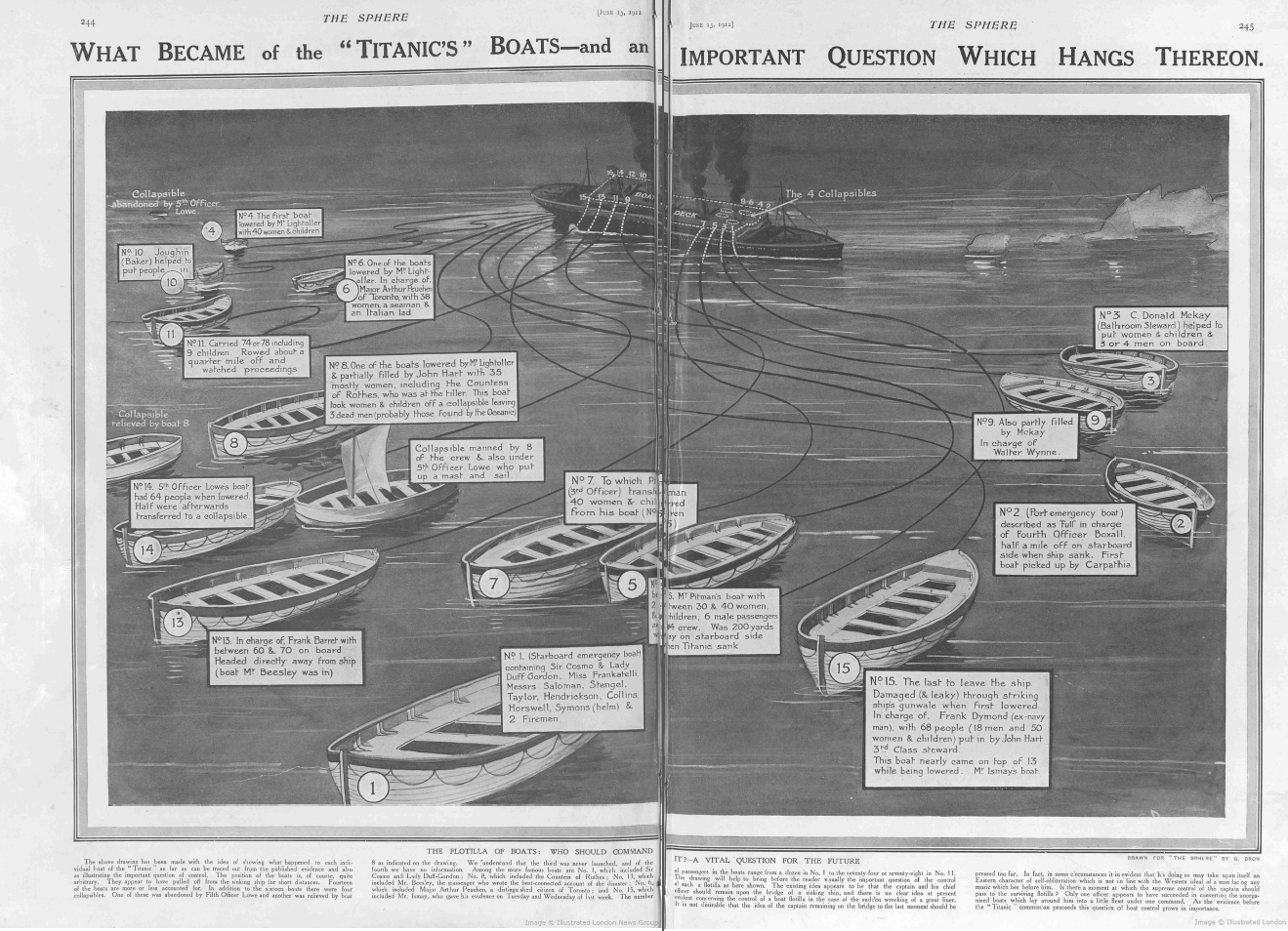
Symanzik, Juergen, Michael Friendly, and Ortac Onder. 2018. “100+ Years of Graphs of the Titanic Data.” CompStat 2018, Iasi, Romania.

———. 2019. “The Unsinkable Titanic Data.” Invited presentation, Joint Statistical Meetings, Denver, Colorado (July 30, 2019). http://datavis.ca/papers/2019_asa-Titanic.pdf.

Theus, Martin. 2002. “Interactive Data Visualization Using Mondrian.” Journal of Statistical Software 7 (2). http://www.jstatsoft.org/v07/i11/.

Varian, Hal R. 2014. “Big Data: New Tricks for Econometrics.” Journal of Economic Perspectives 28 (2): 3–28.

Zeileis, Achim, and Torsten Hothorn. 2017. “Parties, Models, Mobsters: A New Implementation of Model-Based Recursive Partitioning in R.” https://cran.r-project.org/web/packages/partykit/vignettes/mob.pdf.