Visualizing Categorical Data: pscale
$Version: 1.0 (4 Dec 1997)
Michael Friendly
York University
Construct annotations for a probability scale
The PSCALE macro constructs an annotate data set to draw an unequally-
spaced scale of probability values on the vertical axis of a plot (at
either the left or right). The probabilities are assumed to correspond to
equally-spaced values on a scale corresponding to Normal quantiles (using
the probit transformation) or Logistic quantiles (using the logit
transformation).
The PSCALE macro is called with keyword parameters. The arguments may be
listed within parentheses in any order, separated by commas. For example:
  %pscale(out=pscale);
  proc gplot;
     plot logit * X / anno=pscale;
- ANNO=
-
Name of annotate data set [Default:
ANNO=PSCALE]
- OUT=
-
Synonym for ANNO=
- SCALE=
-
Linear scale: logit or probit [Default:
SCALE=LOGIT]
- LO=
-
Low scale value [Default: LO=-3]
- HI=
-
High scale value [Default:
HI=3]
- PROB=
-
List of probability values to be displayed on the axis, in the form of a
list acceptable in a DO statement. [Default: PROB=%str(.05, .1 to .9 by .1,
.95)]
- AT=
-
X-axis percent for the axis.
AT=100 plots the axis at the right; AT=0 plots the axis at the left. [Default: AT=100]
- TICKLEN=
-
Length of tick marks [Default:
TICKLEN=1.3]
- SIZE=
-
Size of value labels
- FONT=
-
Font for value labels
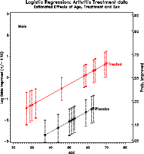
Example
This example analyses improvement in arthritis in a logistic regression
as a function of
treatment, sex and age, with a binary outcome, 'better'.
It produces plots of predicted log odds, with a scale of probabilities
at the right (AT=100).
%include vcd(pscale);        *-- or include in an autocall library;
%include data(arthrit);

proc logistic data=arthrit;
   format better outcome.;
   model  better = _sex_  _treat_  age;
   output out=results p=predict l=lower u=upper
                      xbeta=logit stdxbeta=selogit / alpha=.33;
proc sort data=results;
   by sex treat age;

%pscale(anno=pscale);
data pscale;
   set pscale;
   sex = 'Female'; output;
   sex = 'Male  '; output;
proc sort;
   by sex;

%bars(data=results, var=logit, cvar=treat, class=age, by=sex, barlen=selogit);

proc gplot data=results;
   plot logit   * age = treat / vaxis=axis1 haxis=axis2
                                nolegend anno=bars frame;
   by sex;
   axis1 label=(h=1.3 a=90 f=duplex 'Log Odds Improved (+/- 1 SE)')
         value=(h=1.2) order=(-3 to 3);
   axis2 label=(h=1.3 f=duplex)
         value=(h=1.2) order=(20 to 80 by 10) offset=(2,5);
   symbol1 v=+ h=1.4 i=join l=3 c=black;
   symbol2 v=$ h=1.4 i=join l=1 c=red;

See also
bars Create an annotate data set to draw error bars
catplot Plot observed and predicted logits for logit models
label Create an Annotate dataset to label observations
logodds Plot empirical log-odds for logistic regression
points Create an Annotate dataset to draw points in a plot
![[Previous]](../icons/previous.gif)
![[Next]](../icons/next.gif)
![[Up]](../icons/up.gif)
![[Contents]](../icons/contents.gif)
![[Search]](../icons/search.gif)
Previous: powerlog Next: robust Up: Appendix A Top: index.html