DataVis.ca
Michael Friendly
York University
Title: A History of the Display of Information
Author: R. J. Andrews
Location: San Francisco, CA, U.S.A.
Year: 2017
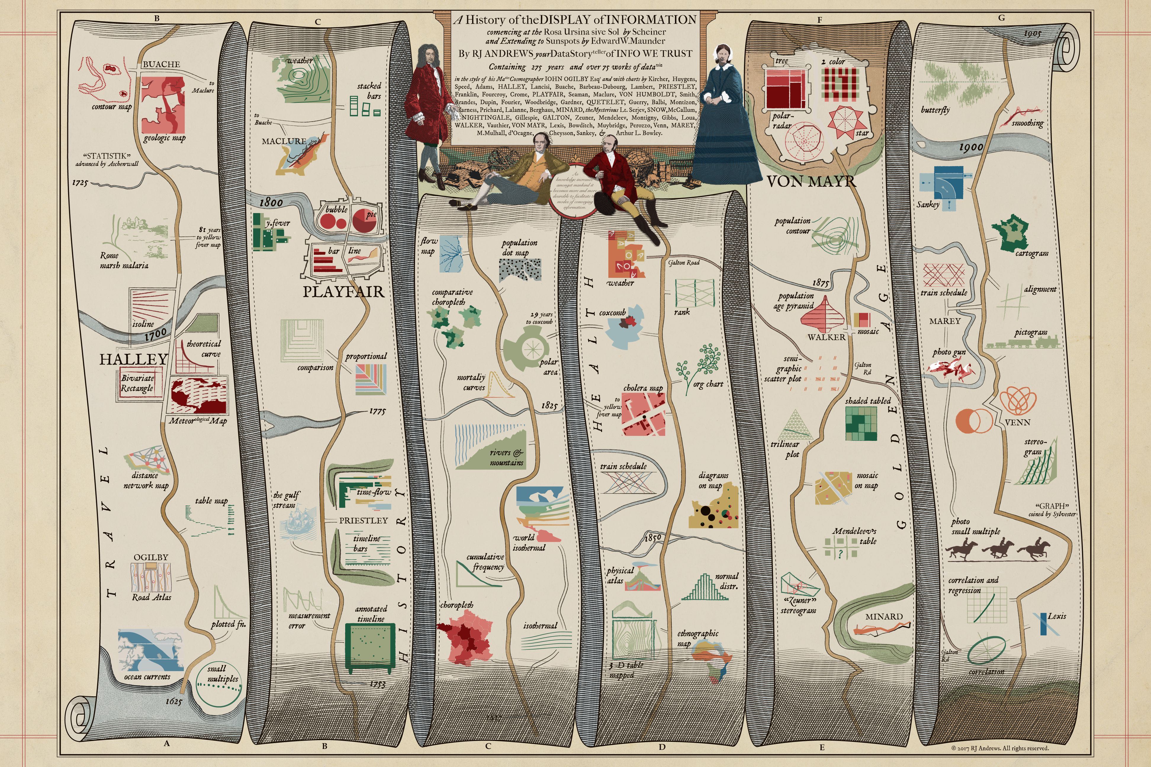
The primary function of maps has always been wayfinding (how do I get from A to B?). But standard maps don’t serve that function as well as route maps. These show one path of travel, and can do so with much greater detail than a standard map affords: what will you see, where to stay, etc. on a given trip.
This image, by Raymond Andrews gives a tour of the history of the graphic display of information as a route map in time. Start the tour at the bottom left (A) and follow the route to see what appears along the way. There are rivers to cross, and attractions to see.
The style of the route map follows one by John Ogilby from 1675, https://commons.wikimedia.org/wiki/File:John_Ogilby_-_The_Road_from_London_to_the_City_of_Bristol_(1675).jpg
.jpg)
Occasionally, a short-cut to a later time appears, as in a trip thru IKEA. This trip ends at the terminus of Galton Road with the invention of the correlation diagram, later called the “data ellipse”.
Source: R.J. Andrews, http://infowetrust.com/history/
See: http://datavis.ca/milestones/ for the complete history.
 Except where otherwise noted, the Gallery of Data Visualization by
Michael Friendly is licensed under a
Except where otherwise noted, the Gallery of Data Visualization by
Michael Friendly is licensed under a Creative Commons Attribution-NonCommercial 3.0 License. Please cite any uses of this work as shown below.
Citation: Friendly, Michael (2001), Gallery of Data Visualization, Electronic document, http://www.datavis.ca/gallery/,