DataVis.ca
Michael Friendly
York University

Darts |
|---|
 Missed Opportunities and Graphical Failures
| Picture | Words |
|---|---|
|
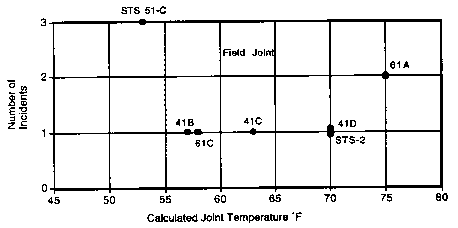
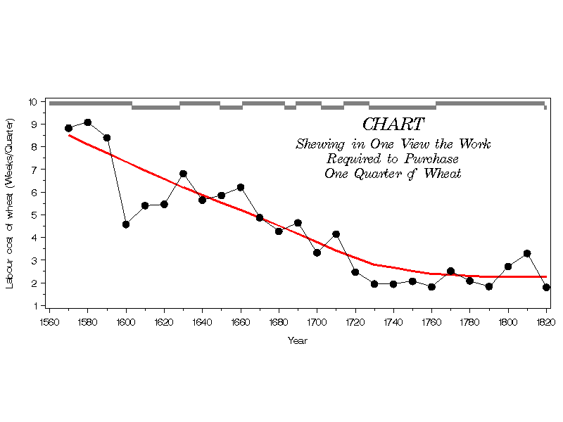
The Challenger Disaster Full size (451x228) [3K].
The Space Shuttle Challenger exploded shortly after take-off in January 1986. Subsequent investigation determined that the cause was failure of the O-ring seals used to isolate the fuel supply from burning gases. This figure (scanned badly from Wainer, 1995) shows a graph accompanying the Report of the Presidential Commission on the Space Shuttle Challenger Accident, 1986 (vol 1, p. 145) in the aftermath of the disaster. NASA staff had analysed the data on the relation between ambient temperature and number of O-ring failures (out of 6), but they had excluded observations where no O-rings failed, believing that they were uninformative. Unfortunately, those observations had occurred when the launch temperature was relatively warm (65-80 degF). |

|
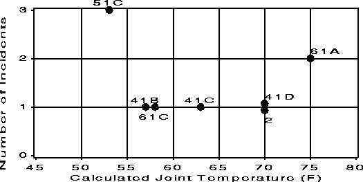
The Challenger Disaster Full size (494x424)[4K].
Reanalysis of the O-ring data involved fitting a logistic regression model. This provides a predicted extrapolation (black curve) of the probability of failure to the low (31 degF) temperature at the time of the launch and confidence bands on that extrapolation (red curves). See also Tappin, L. (1994). "Analyzing data relating to the Challenger disaster". Mathematics Teacher, 87, 423-426 There's not much data at low temperatures (the confidence band is quite wide), but the predicted probability of failure is uncomfortably high. Would you take a ride on Challenger when the weather is cold? See also: Gary McClelland's Graphs on the Web: Challenger Story, with a Java applet |
|
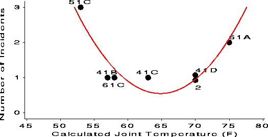
But, what if they had made a better graph?
Initial graph, full size (525x263)[4K];
Re-designed graph, full size (525x269)[4K].
The original graph was prepared by engineers from the contractor, Morton Thiokol, and it is perhaps unreasonable to expect that a sophistocated statistical analysis of the data should have been carried out, given the time pressure for a launch / no-launch decision.
Nevertheless, it is of interest to ask whether a re-design of the original
graph might have signalled that something was amiss. Apart from the
disasterous blunder of omitting the observations with 0 failures,
two steps, |
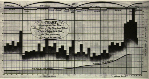  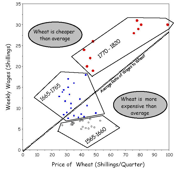 |
Playfair's Charts, revisited
Prices, wages and reigns, Full size (504x267) [109K];
Re-drawn as ratios, Full size (800 x 600; 7.3K);
Re-drawn as scatterplot, Full size (674 x 646; 65K);
William Playfair's charts are often considered as examples of graphical excellence, but a close examinination shows that this chart must be counted as a graphical failure, and also as a graphical sin. He shows here three time series--- weekly wages (of a "good mechanic"), prices (of a quarter of wheat), and reigns of British monarchs. The graphical sin is that he used separate scales for wages (0-100) and prices (0-30). The relationship between these two would change dramatically if either was re-scaled (e.g., daily or monthly wages).
The graphical failure is both more subtle and profound. Playfair wished to
compare wages and prices, and conclude
from this chart that
But, what the graph actually shows directly is quite different. The strongest visual message is that wages remained relatively stable (increasing very slowly up to the reign of Queen Anne and at a somewhat greater rate thereafter), while the price of wheat varied greatly. The inference that wages increased relative to prices toward the end is at best indirect and not visually compelling. The re-drawn version plots the ratio of prices / wages directly, and shows directly that that workers became increasingly better off over time, exactly the message he tried, unsuccessfully, to convey. Moreover, it shows something more-- the ratio of prices/wages declined, but at a decreasing rate. Howard Wainer drafted the second revision of Playfair's chart as a scatterplot, but with clusters of time periods and helpful annotations to make the message of the graph abundantly clear, even without a figure caption (a good test for any presentation graphic). It's gratifying to be able to teach an old master a thing or two sometimes. See our paper Nobody's Perfect appearing in Chance, V.17(2). |
|
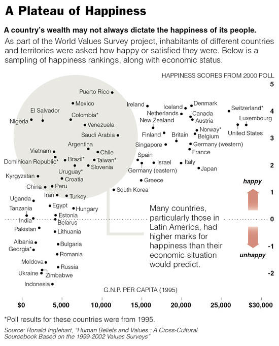
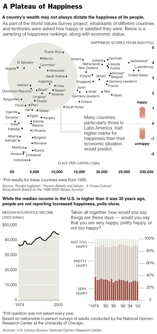
What's wrong with this picture?
Happiness graph, full size ;
Full NYT graphic .
The New York Times is usually a paragon of graphic portrayal of quantitative information. Here is one case where they got it wrong, but the reasons are subtle and technical for a newspaper graphic designer. The goal of the graphic was to present results of a poll of happiness from the World Values Survey project of people throughout the world in relation to economic status, as measured by GNP per capita. The graph carefully identified all the countries in this scatterplot, but then singled out a collection with low GNP and high happiness scores, saying Many countries, particularly those in Latin America, had higher marks for happiness than their economic situation would predict. The main thing that is wrong here is the conclusion, based on the assumption that happiness should be linearly related to GNP. But the graph, and most analyses of such data cries out for GNP to be re-expressed on a log scale, so that happiness is being linearly related to multiples of GNP, rather than to constant increments. Skill testing question: Without doing the conversion, which countries stand out as unusualy happy or unhappy, given their log(GNP)? |
