With the fertilization provided by the previous innovations of design
and technique, the first half of the 19th century witnessed explosive growth in statistical graphics and thematic mapping, at a rate which would not be equalled until modern times.
In statistical graphics, all of the modern forms of data display were invented:
bar and pie charts, histograms, line graphs and time-series plots, contour plots, and so forth. In thematic cartography, mapping progressed from
single maps to comprehensive atlases, depicting data on a wide variety
of topics (economic, social, moral, medical, physical, etc.), and introduced a wide range
of novel forms of symbolism.
- 1800
-
Use of coordinate paper in published research (graph of barometric variations)- Luke Howard (1772-1864), England [139].
PIC: Luke Howard portrait (170 x 207; 13K)
TXT: Luke Howard biography
TXT: Luke Howard: The man who named clouds
- 1800
-
Idea for continuous log of automatically recorded time series graphs (of temperature and barometric pressure), also recording the maximum and minimum- Alexander Keith , England [159].
- 1801
-
Invention of the pie chart, and circle graph, used to show part-whole relations-
William Playfair (1759-1823), England [238,236,271].
IMG: Playfair's 1805 Statistical Representation of the U.S.A. (265 x 286; 10K)
FIG: Playfair's 1805 Statistical Representation of the U.S.A. (612 x 689; 76K)
IMG: Playfair's diagram of population and taxes (474 x 336; 21K)
TXT: Oxford DNB article by Ian Spence (pdf)
- 1801
-
The first large-scale geological map of
England and Wales, setting the pattern for geological cartography,
and founding stratigraphic geology. Recently called (hyperbolically) ``the
map that changed the world'' [325]. (Smith's map was first drawn in 1801,
but the final version was not published until 1815.)- William Smith (1769-1839), England[268,205].

PIC: William Smith portrait (99 x 169; 4K)
FIG: Smith's 1815 map (244 x 250; 22K)
FIG: Smith's map, in zoomable sections
TXT: William ``Strata'' Smith on the Web
TXT: William Smith, from ``The Rocky Road to Modern Paleontology and Biology''
TXT: William Smith (1769-1839), ``The Father of English Geology''
TXT: William Smith, history
TXT: Transcript of pages from Smith's 1816-1824 Strata Identified By Organized Fossils
The first known geological map was produced by Christopher Packe in 1743, and depicts South England. Smith's map is impressive
for its size (about 6 x 9 feet--- printed as 15 separate copperplate engravings for a 5x3 grid), scope (all of England, Wales, and part of Scotland), beauty (elaborately hand-colored)
and detail. More importantly, he was the first to discover that the strata of England were in a definite order and the first to show that
their fossil contents were in the same order.
- 1809
-
Methods of determining an orbit from at least three observations; presentation of the least squares method- Johann Carl Friedrich Gauss (1777-1855), Germany [102].
TXT: Gauss biography
- 1811
-
Charts using subdivided bar graphs, and superimposed squares, showing the relative size of Mexican territories and populations in the colonies - Alexander von Humboldt (1769-1859), Germany [142].
PIC: Humboldt portrait, young (761 x 945; 26K)
PIC: Humboldt portrait (200 x 254; 28K)
FIG: von Humboldt charts (578 x 768; 48K)
FIG: Cross-section diagram of the Chimborazo, 1805-07 (2155 x 1494; 259K)
TXT: Humboldt biography (French)
TXT: von Humboldt biography
- 1817
-
First graph of isotherms, showing mean temperature around the world by latitude and longitude.
Recognizing that temperature depends more on latitude and altitude, a subscripted graph shows the direct relation of temperature on these two
variables- Alexander von Humboldt (1769-1859), Germany [143].
IMG: von Humboldt isotherm icon (120 x 87; 6K)
FIG: von Humboldt isotherm (492 x 357; 60K)
FIG: von Humboldt isotherms from Berghaus' 1849 Atlas (768 x 577; 79K)
FIG: von Humboldt isotherms, Annals de Chemie et de physique, 1817 (937 x 744; 616K)
- 1819
-
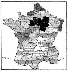
Choropleth map with shadings from black to white (distribution and intensity of illiteracy in France), the first (unclassed) choropleth map, and perhaps the first
modern statistical map. (This map dates from 1826 [61,Plate 1, vol. 2] according to
Robinson [253,p. 232], rather than 1819 according to Funkhouser
[92])- Baron Pierre Charles Dupin (1784-1873), France [60].
PIC: Dupin portrait (393 x 512; 35K)
PIC: Dupin portrait, with his map (600 x 707; 135K)
IMG: Dupin choropleth map of France (220 x 229; 34K)
FIG: Dupin choropleth map of France (1223 x 1270; 426K)
TXT: Dupin biography
This entry is now deprecated.
- 1820s
-
An increasing number of scientific publications begin to contain graphs and diagrams which describe, but do not analyze, natural phenomena (magnetic variation, weather, tides, etc.)- Michael Faraday (1791-1867), England.
IMG: Faraday diagram of a magnet with lines of force (294 x 373; 13K)
TXT: Michael Faraday's Lines of Force, by Dan Denis
TXT: Faraday biography with portraits
- 1821
-
Ogive or cumulative frequency curve, inhabitants of Paris by age groupings (shows the number of inhabitants of Paris per 10,000 in 1817 who were of a
given age or over. The name ``ogive'' is due to Galton.)- Jean Baptiste Joseph Fourier (1768-1830), France [77].
PIC: Fourier portrait (268 x 326; 15K)
IMG: Fourier ogive (750 x 456; 12K)
TXT: Fourier biography
- 1822
-
Mechanical device for calculating mathematical tables (the Difference Engine) [The beginnings of computing as we know it today. The Difference
Engine was steam-powered, and the size of a locomotive.] - Charles Babbage (1791-1871), England.
PIC: Babbage portrait (280 x 340; 4K)
IMG: Babbage Difference Engine (440 x 437; 31K)
TXT: Babbage biography
- 1825
-
Gompertz curve, derived to describe expected mortality statistics for a population of organisms whose probability of death increases as a function of
time- Benjamin Gompertz (1779-1865), England [109].
PIC: Gompertz portrait (200 x 241; 38K)
TXT: Gompertz biography
TXT: The Gompertz model
Gompertz showed that the mortality rate increases in a geometric progression. Hence, when death rates are plotted on a logarithmic scale, a straight line known as the Gompertz function is obtained. The slope of the Gompertz function line indicates the rate of actuarial ageing. The differences in longevity between species are the result primarily of differences in the rate of ageing and are therefore expressed in differences in slope of the Gompertz function.
- 1826
-
Choropleth map with shadings from black to white (distribution and intensity of illiteracy in France), the first (unclassed) choropleth map, and perhaps the first
modern statistical map- Baron Pierre Charles Dupin (1784-1873), France [60].
PIC: Dupin portrait (393 x 512; 35K)
FIG: Dupin choropleth map of literacy in France (909 x 953; 321K)
TXT: Dupin biography
- 1827
-
First successful photograph produced (an 8-hour exposure).
[A type of asphalt (bitumen of Judea) was coated on metal plates.
After exposure it was washed in solvents, the light areas were
shown by the bitumen, dark areas by bare metal. Exposed to iodine, the
plate darkened in the shadowed areas.]- Joseph Nicephore Niépce , France.
PIC: Niepce portrait (75 x 100; 2K)
IMG: Niepce photo, Point de vue du Gras (206 x 148; 2K)
TXT: Catalog of Niepce heliographies
TXT: University of Texas exhibition: The first photo
- 1828
-
Mortality curves drawn from empirical data (for Belgium and France)- Adolphe Quetelet (1796-1874), Belgium [243].
PIC: Quetelet portrait (268 x 326; 25K)
TXT: Quetelet biography
TXT: Quetelet biography
TXT: Quetelet web site
- 1829
-
Polar-area charts (predating those by Florence Nightingale [213]), showing frequency of events for cyclic phenomena- André-Michel Guerry (1802-1866), France
[112].
FIG: Guerry barcharts and polar diagrams (3526 x 2402; 3114K)
FIG: Guerry's polar diagrams (814 x 626; 148K)
The plate shows six polar diagrams for daily phenomena: direction of the wind in 8 sectors, births and deaths by hour of the
day.
- 1829
-
The first comparative choropleth thematic maps, showing crimes against persons and crimes against property in relation to
level of instruction by departments in France- André-Michel Guerry (1802-1866) and Adriano Balbi (1782-1884), France
[12,113].
FIG: Balbi-Guerry maps (2080 x 2000; 654K)
- 1830-1835
-
Graphical analysis of natural phenomena begins to appear on a regular basis in scientific publications, particularly in England.
For example, in 1832, Faraday proposes pictorial representation of electric and magnetic lines of force.- Michael Faraday (1791-1867), England
PIC: Faraday portrait (203 x 176; 14K)
FIG: Faraday's iron filing diagrammes, the earliest ever made (300 x 390; 46K)
TXT: Faraday biography
TXT: Faraday bio, with images
- 1830
-
First simple dot map of population by department, 1 dot = 10,000 people- Armand Joseph Frère de Montizon (1788-?), France [204].
IMG: see [253,Fig. 49]
FIG: Dot map of population of France, 1830 (360 x 238; 53K)
- 1832
-
Fitting a smoothed curve to a scatterplot, advocacy of graph paper and graphical methods as standard tools of science.
[``The process by which I propose to accomplish this is one essentially graphical; by which term I understand not a mere substitution of geometrical
construction and measurement for numerical calculation, but one which has for its object to perform that which no system of calculation can possibly
do, by bringing in the aid of the eye and hand to guide the judgment, in a case where judgment only, and not calculation,
can be of any avail.'' (p. 178)]
- John Frederick W. Herschel (1792-1871), England [134].[122]
PIC: Herschel portrait (160 x 238; 11K)
FIG: Herschel's graph of position vs time for g; Virginis (745 x 686; 263K)
FIG: Derived double-orbit for g Virginis (648 x 733; 205K)
e
TXT: Herschel images
TXT: Herschel biography
See \cite{BrockPrice:1980} for some history of ``squared paper.''
- 1833
-
The first comprehensive analysis of data on ``moral statistics'' (crimes, suicide, literacy, etc.) shown on thematic unclassed choropleth maps; bar charts (of crime, by age groupings and months)- André Michel Guerry (1802-1866), France
[114].
TXT: Reference to English translation
FIG: Guerry's map of crimes against persons in France (1500 x 1595; 278K)
FIG: Guerry's map of crimes against property in France (1500 x 1603; 224K)
FIG: Guerry's map of ``instruction'' in France (1500 x 1556; 353K)
FIG: Guerry's map of suicides (1500 x 1592; 273K)
- 1833
-
Graphical rank lists, with lines showing shifts in rank order between categories (rank of types of crime from one age group to the next)- André Michel Guerry (1802-1866), France
[114].
- 1833
-
First classed depiction of population density on a world map (using three broad classes in a dasymetric map)- George Julius Poulett Scrope (1797-1876), England [261].
TXT: Scrope biography
TXT: Wikipedia: Scrope biography
- 1833
-
Invention of the stereoscope, revealing the dependence of visual depth perception upon binocular vision, and allowing production of stereoscopic images- Charles Wheatstone (1802-1875), England.
PIC: Charles Wheatstone portrait (225 x 260; 15K)
TXT: Stereoscopic photography
TXT: Wheatstone biography
TXT: Wheatstone uses paper tape to store data
In 1857, Wheatstone also introduced the first application of paper tapes as a medium for the preparation, storage, and transmission of data.
- 1836
-
First broad and general application of principles of graphic representation to national industrial and population data-
Adolphe d' Angeville (1796-1856), France [6,56]
FIG: Population of France, Carte 1 (946 x 1213; 226K)
FIG: Taille, Carte 5 (413 x 518; 85K)
TXT: Angeville biography
- 1836
-
Extensive data tabulation, time series, and mapping of prostitutes in Paris- Alexandre Jean Baptiste Parent-Duchatelet (1790-1836), France
[225] .
FIG: Duchatelet's map showing the origins of prostitutes in Paris (729 x 557; 178K)
FIG: Duchatelet's map showing the distribution of prostitutes in Paris (650 x 509; 153K)
TXT: English translation of On prostitution in the city of Paris
- 1837
-
First published flow maps, showing transportation by means of shaded lines, widths proportional to amount (passengers)- Henry Drury Harness (1804-1883), Ireland
[123,251].
IMG: see [253,Fig. 71]
PIC: Harness portrait (188 x 305; 35K)
FIG: Harness flow map of transportation of passengers in Ireland (1888 x 2923; 170K)
- 1838
-
Physical atlas of the distribution of plants, animals, climate, etc., one of the most extensive and detailed thematic atlases; most of the
maps contained tables, graphs, pictorial profiles of distributions over
altitude, and other visual accompanyments- Heinrich Berghaus (1797-1884), Germany [24].
IMG: Berghaus map icon (149 x 120; 12K)
TXT: Berghaus map, high-res
FIG: World map showing the tradewinds (768 x 577; 88K)
FIG: Charts showing temperature throughout the world (768 x 577; 80K)
FIG: Full colour ``ideal'' geologic cross-section (768 x 351; 55K)
TXT: Berghaus biography
- 1839
-
Development of the logistic curve, y = k / (1 + C ert), to describe the growth of human populations-
Pierre-François Verhulst (1804-1849), Belgium [245].
PIC: Verhulst portrait
TXT: Verhulst bio
TXT: Pierre-Francois Verhulst et la loi logistique de la population
Verhulst showed that forces which tend to prevent a population growth grow in proportion to the ratio of the excess population to the total population. (reference from Funkhouser:1937, p.363 fn(46)
- 1839
-
Invention of the first practical photographic process, using coated plates of metal and glass- Louis Jacques Mandé Daguerre (1787-1851), France.
FIG: Daguerre, Parisian Boulevard (560 x 394; 48K)
TXT: The Daguerrian Society (with comprehensive links and images)
The first daguerrotype of the disk of the Sun was obtained by two physicists in Paris in 1845 see \cite[p. 54]{GribbinGribbin:2000}, and subsequent improvements in emulsion speeds had enormous repercussions for astronomy.
- 1843
-
Contour map of a 3D table, temperature x hour x month (published in 1845)- Léon Lalanne (1811-1892), France [164].
IMG: Lalanne contour diagram (98 x 120; 10K)
FIG: Lalanne contour diagram (322 x 394; 79K)
TXT: Lalanne biography
- 1843
-
Use of polar coordinates in a graph(frequency of wind directions)- Léon Lalanne (1811-1892), France [164].
IMG: Lalanne windrose diagram (225 x 203; 24K)
- 1843
-
Ethnographic maps showing distribution of ethnic groups throughout the world- James Cowles Pritchard (1786-1848) and Alexander Keith Johnston (1804-1871),
UK [241], [155]
PIC: James Cowles Prichard portrait (250 x 332; 16K)
FIG: Ethnographical map of Africa (440 x 512; 26K)
FIG: Ethnographical map of Europe (512 x 431; 33K)
FIG: Ethnographical map of Europe (384 x 267; 21K)
TXT: Pritchard biography
TXT: Johnston bio and portrait (pdf)
TXT: Johnston biography
- 1844
-
``Tableau-graphique'' showing transportation of commercial traffic by variable-width (distance), divided bars (height ~ amount), area
~ cost of transport [An early form of the mosaic plot.]- Charles Joseph Minard (1781-1870), France [196]; see also: [56,252].
IMG: Minard Tableau graphique (354 x 276; 20K)
TXT: Minard biography
- 1846
-
Logarithmic grid (the first log-log plot, as a nomogram for showing products from the factors)- Léon Lalanne (1811-1892), France [165].
IMG: Lalanne nomogram icon (120 x 118; 8K)
IMG: Lalanne nomogram image (221 x 206; 16K)
FIG: Lalanne's Universal Calculator (2317 x 2868; 529K)
TXT: l'Ecole des mines: Lalanne ``compteur universel'' and other calculating diagrams
See also: Lalanne's ambitious \emph{Universal Calculator} \cite{Lalanne:1844}, combining logarithmic and trigonometric
calculations (described by Tourn{\`e}s \cite{Tournes:2000}).
- 1846
-
Results of sampling from urns shown as symmetrical histograms, with limiting ``curve of possibility'' (later called the normal curve)- Adolphe Quetelet (1796-1874), Belgium [246].
FIG: Quetelet's graph of a binomial distribution, 999 trials (594 x 374; 34K)