By the mid-1800s, all the conditions for the rapid growth of visualization
had been established. Official state statistical offices were established
thoughout Europe, in recognition of the growing importance of numerical
information for social planning,
industrialization, commerce, and transportation.
Statistical theory, initiated by Gauss and Laplace, and extended to the
social realm by Guerry [
114] and Quetelet [
244], provided the means to make sense of large bodies
of data.
What started as the ``Age of Enthusiasm'' [223]
in graphics and thematic cartography, may also be called the ``Golden Age'', with unparalleled beauty
and many innovations.
- 1851
-
Map incorporating statistical diagrams: circles proportional to coal production (published in 1861)- Charles Joseph Minard (1781-1870), France [197].
FIG: Pie-map showing origin of meats consumed in Paris (341 x 349; 9.6K)
- 1852
-
Statistical graphics used in a lawsuit. (Reported by Ernst Engel at the 7th meetings of the
International Statistical Congress, 1869, The Hague [92,p. 316])- Germany.
- 1853
-
First international statistics conference (organized by Quetelet)- International Statistical Institute Belgium [248].

TXT: ISI History
TXT: ISI historical biography
TXT: Quetelet biography
- 1855
-
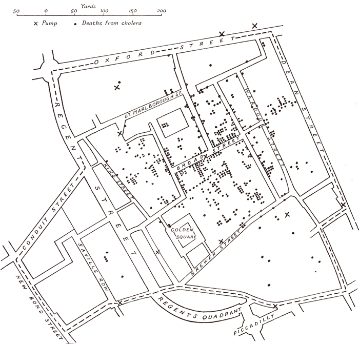
Use of a dot map to display epidemiological data, leads to discovery of the source of a cholera epidemic- John Snow (1813-1858 ), England [270,106].
PIC: Snow portrait (129 x 156; 11K)
IMG: Snow cholera map (160 x 143; 33K)
FIG: same, larger (700 x 671; 105K)
FIG: same, larger (764x852; 400K)
FIG: Cholera map (698 x 652; 510k)
TXT: John Snow UCLA web site, with zoomable images
TXT: John Snow MSU web site, online companion to a Snow biography
- 1857
-
Discussion of standardization and classification of graphical methods at the Third International Statistical Congress- Vienna, Austria [149].
TXT: The debate on the standardization of statistical maps and diagrams (1857-1901), Cybergeo, No. 85
- 1857
-
Exhibition display of graphs and cartograms. Third International Statistical Congress- Vienna, Austria [149].
- 1857
-
Polar area charts, known as ``coxcombs'' (used in a campaign to improve sanitary conditions of army)- Florence Nightingale (1820-1910), England [213].
PIC: Nightingale portrait (106 x 134; 6K)
IMG: re-creation of a coxcomb (148 x 154; 1K)
IMG: Nightingale coxcomb (398 x 263; 10K)
TXT: Florence Nightingale's Statistical Diagrams
TXT: JSE article: A Dialogue with Florence Nightingale
TXT: Florence Nightingale by I. Bernard Cohen
- 1861
-
The modern weather map, a chart showing area of similar air
pressure and barometric changes by means of glyphs displayed
on a map. These led to the discovery of the anti-cyclonic movement of wind around low-pressure areas- Francis Galton (1822-1911), UK
[97,98].
PIC: Portrait of Galton by Furse (198 x 200; 22K)
TXT: A comprehensive Galton web site, with many publications and images
TXT: Galton's 1861 ``Meteorological charts'', Philosophical Magazine
TXT: Galton's 1870 ``Barometric predictions of weather'', Nature
FIG: Galton's 1881 weather chart (470 x 593; 66K)
- 1861
-
Invention of the trichromatic process for making color photographs, by taking three monochrome images through red, green and blue filters- James Clerk Maxwell (1831-1879),
England.
PIC: Portrait of Maxwell (200 x 196; 22K)
TXT: Maxwell biography
TXT: Maxwell biography
- 1863
-
Semilogarithmic grid (showing percentage changes in commodities)- William Stanley Jevons (1835-1882), England [150,151].
PIC: Jevons portrait (268 x 326; 13K)
FIG: Graphical method, from [151] (401 x 284; 39K)
FIG: Quantitative induction, from [151] (400 x 673; 95K)
TXT: Jevons Home page, by Bert Mosselmans
TXT: Jevons biography
TXT: Jevons in Sidney and the logic piano
TXT: Comprehensive bibliography
- 1868
-
Statistical diagrams used in a school textbook- Émile Levasseur (1828-1911), France [173].
PIC: Levasseur portrait (404 x 543; 95K)
TXT: Link to bio blurb and texts
- 1869
-
Three-dimensional population surface or ``stereogram,'' with axonometric projection to show curves of
various ``slices'' (sometimes known as a ``Zeuner diagram)''-
Gustav Zeuner (1828-1907), Germany
[330].
PIC: Zeuner portrait (180 x 261; 9.8K)
TXT: Wiklipedia: Zeuner biography
- 1869
-
Minard's flow map graphic of Napoleon's March on Moscow (called ``the best graphic ever produced'' by Tufte [291])- Charles Joseph Minard (1781-1870), France [198].
TXT: Web page for ``Re-visions of Charles Joseph Minard''
IMG: Minard's March on Moscow graphic (569 x 273; 30K)
- 1869
-
The periodic table used to classify chemical elements according to their properties, and allowing the prediction of new elements that would be
discovered later.- Dmitri Mendeleev (1834-1907), Russia.
PIC: Mendeleev portrait (152 x 232; 13k)
PIC: Mendeleev portrait (152 x 232; 13k)
TXT: Mendeleev periodic table, and other pictorial representations
TXT: Mendeleev biography
Mendeleev arranged all of the 63 elements, then known by their atomic weights, into groups possessing similar properties. Where a gap existed in the table, he predicted a new element would one day be found and deduced its properties. Three of those elements were found during his lifetime
- c. 1870
-
Election map of Paris, showing the breakdown of votes by parties-Leon Montigny , France [203].
FIG: Montigny election map
- 1872
-
Congressional appropriation for graphical treatment of statistics- USA
- 1872
-
Use of statistical graphics by USA Government in census reports (cartograms of data from Ninth Census)- U.S. Bureau of the Census , USA [300].
- 1872
-
Classification of statistical graphical treatments by form, with consideration of appropriate uses of color, graphical elements, limitations of perception.
At the 8th ISI meetings, St. Petersburg.- Hermann Schwabe (1830-1875), Germany [260,44].
- 1872
-
Recording of motion (of a running horse) by means of a set of glass-plate cameras, triggered by strings- Eadweard Muybridge (1830-1904), USA.
IMG: Galloping Horse, 1878 (370 x 227; 20K)
FIG: Galloping Horse, 1878 (635 x 391; 44K)
TXT: UCR Museum of Photography, animated Muybridge Gallery
TXT: Eadweard Muybridge's photography of motion
TXT: Muybridge photos, with timeline and bio
TXT: Muybridge's zoopraxiscope
TXT: Complete history of cinematography
- 1873
-
Graphical methods applied to explain fundamental relations in thermodynamics; this includes diagrams of entropy vs. temperature (where work or heat is proportional to area), and
the first use of trilinear coordinates (graphs of (x,y,z) where x+y+z=constant)- Josiah Willard Gibbs (1839-1903), USA [38,104,105].
PIC: Gibbs portrait (140 x 177; 6.3K)
TXT: Gibbs biography
FIG: Plot on trilinear graph paper by R. A. Fisher, ca. 1955 (540 x 425; 70K)
TXT: Gibbs, Elementary principles in statistical mechanics
TXT: Gibb's models
- 1873
-
First-known use of a semi-graphic table to display a data table by shading levels- Toussaint Loua (1824-1907), France [178].
TXT: Google Books: Atlas Statistique de la Population de Paris
FIG: Loua scalogram of 40 characteristics of 20 Paris districts (2422 x 1932; 1386K)
FIG: Loua scalogram, color version (1212 x 960; 318K)
FIG: Shaded map of Paris showing number of inhabitants per house (935 x 615; 77K)
Loua used this as a graphic summary of 40 maps of Paris, each showing some feature of the population by arrondisement.
This device was later used by Bertin \cite{Bertin:1967}, who also considered ways of reordering the rows and columns (the ``reorderable matrix'') to make the pattern of high/low values more apparent.
- 1874
-
Age pyramid (bilateral histogram), bilateral frequency polygon, and the use of subdivided squares to show the
division of population by two variables jointly (an early mosaic display)
in the first true U.S. national statistical
atlas- Francis Amasa Walker (Superintendent of
U.S. Census) (1840-1897), USA [314].
TXT: History of US census atlases
TXT: Text of the Statistical Atlas of 1870
TXT: detailed Walker biography
PIC: Portrait (186 x 238; 7K)
PIC: Walker portrait (202 x 252; 52K)
IMG: Population pyramid (240 x 172; 10K)
IMG: Cover of the 1870 Statistical Atlas (113 x 150; 4K)
TXT: Detailed Walker biography
- 1874
-
Population contour map (population density shown by contours), the
first statistical use of a contour map-
Louis-Léger Vauthier (1815-1881), France [305].
PIC: Vauthier portrait (200 x 352; 13K)
IMG: Vauthier contour map (160 x 240; 4K)
FIG: Vauthier contour map (1405 x 2072; 767K)
FIG: Estuaire de la Seine en 1834 (650 x 315; 36K)
TXT: Wikipedia: Louis-Léger Vauthier
- 1874
-
Two-variable color map (showing the joint distribution of horses (red, vertical bars) and cattle (green, horizontal bars) in Bavaria, widths of bars ~ animals/km2)-
Georg von Mayr (1841-1925), Germany [191,Fig. XIX]
IMG: see [312,p. 20].
PIC: von Mayr Portrait(223 x 248; 57k)
- c. 1874
-
Galton's first semi-graphic scatterplot and correlation diagram, of head size and height, from
his notebook on Special Peculiarities- Francis Galton (1822-1911), England.
FIG: Galton correlation diagram, from [136] (631 x 898; 569K)
TXT: Comprehensive Galton site: biography, papers, images
- 1875
-
Lexis diagram, showing relations among age, calendar time, and life spans of individuals simultaneously
(but the paternity of this diagram is in dispute [304])- Wilhelm Lexis (1837-1914), Germany [175].
PIC: Lexis portrait (378 x 538; 55K)
IMG: Lexis diagram (468 x 468; 6K)
TXT: Illustrated description of the Lexis diagram
TXT: The Lexis diagram, a misnomer
TXT: Visualisation using Lexis pencils
- 1875
-
Galton's first illustration of the idea of correlation, using sizes of the seeds of mother and daughter plants- Francis Galton (1822-1911), England [227].
PIC: Galton portrait (268 x 326; 7k)
FIG: Galton's first correlation diagram
TXT: Comprehensive Galton website
In 1875, Galton was interested in the inheritance of size in sweet-pea seeds, but appears to have tried with smaller seeds first, apparently that of cress. The isograms are represented by ink lines on the sheet of glass covering the little compartments which contain the ranked seeds of the daughter-plants.
- 1877
-
First use of proportional, divided square in the modern (mosaic) form for data representation- Georg von Mayr (1841-1925), Germany [192,S. 80].
PIC: von Mayr portrait (351 x 448; 14K)
IMG: von Mayr's Area diagram (194 x 190; 3K)
- 1877
-
First use of polar diagrams and star plots for data representation- Georg von Mayr (1841-1925), Germany [192,S. 78][221].
IMG: von Mayr's polar diagram (181 x 181; 2K)
- 1877
-
Extensive statistical study of 24,500 children to improve school practice; early ideas of correlation and regression by
quoting the ``measure of stoutness'', the ratio of annual increase in pounds weight to annual increase in inches height. Includes
six charts, showing curvilinear regresions.- Henry Pickering Bowditch (1840-1911),
Boston MA, USA [31],[315,p. 98-102]
PIC: Bowditch portrait (325 x 435; 8.5k)
FIG: Early regression curves of height on weight for Boston schoolboys (507 x 514; 43K)
FIG: Early regression of heigh on weight for English schoolboys (500 x 504; 43K)
Separate series of graphs showing the regression of height (or weight) on age and weight on height
- 1878
-
First attempt to survey, describe, and illustrate available graphic methods for experimental data- Etienne-Jules Marey (1830-1904), France [183].
PIC: Marey portrait (79 x 131; 1K)
PIC: Marey portrait (210 x 302; 10K)
TXT: Google Books: La Méthode Graphique
TXT: Etienne Jules Marey - Movement in Light
TXT: Pioneers in Aeromodeling: E. J. Marey
- 1878
-
The term ``graph'' introduced, referring to diagrams showing analogies between the chemical bonds in molecules and graphical representations of mathematical
invariants (also coined the term ``matrix'') - James Joseph Sylvester (1814-1897), UK [278].
IMG: Sylvester's diagram icon (85 x 120; 7K)
PIC: Sylvester portrait (339 x 335; 18K)
FIG: Sylvester's diagram image (421 x 594; 88K)
TXT: Sylvester biography
TXT: Wikipedia: Sylvester
- 1879
-
Stereogram (three-dimensional population pyramid) modeled on actual data (Swedish census, 1750-1875)- Luigi Perozzo , Italy [229].
IMG: Perozzo stereogram icon (160 x 195; 5K)
IMG: Perozzo stereogram image (613 x 727; 102K)
IMG: Perozzo ilustration of systems for 3D representation (392 x 625; 34K)
- 1879
-
Published instructions on how to use graph paper- William Stanley Jevons (1835-1882), England [151].
TXT: Biography
- 1879-1899
-
Album de Statistique Graphique, an annual series over 20 years, using all known graphic forms (map-based pies and stars, mosaic, line graphs, bar charts,
and, of course, numerous flow maps) to depict data relevant to planning (railways, canals, ports, tramways, etc.)
[This series, under the direction of Émile Cheysson, is regarded as the
epitome of the ``Golden Age of Statistical Graphics'']- Émile Cheysson (1836-1910) and Ministere de Traveaux Publics , France [199,223].
PIC: Cheysson portrait (295 x 378; 12K)
TXT: Cheysson bio sketch
- 1880
-
Representation of logical propositions and relations diagrammatically. [Actually, Liebnitz and, to some degree, Euler had used such diagrams previously.]- John Venn (1834-1923), England [306,307]
PIC: Venn portrait (268 x 326; 9K)
IMG: Venn diagram (174 x 139; 0.9K)
TXT: A survey of Venn diagrams
TXT: Venn biography
TXT: Create your own Venn diagram
TXT: Wikipedia page on Venn and similar diagrams
- 1882
-
Invention of precursor of motion-picture camera, recording a series of photographs to study fight of birds, running and walking- Etienne-Jules Marey (1830-1904), France [182].
TXT: Expo-Marey: Movement in Light
IMG: Somersault icon (161 x 44; 2K)
IMG: Somersault image sequence (612 x 46; 8K)
- 1882
-
Statistical reasoning employed to create a new system of bodily measurement, specifically for identifying criminals- Alphonse Bertillon (1853-1914), France.
PIC: Bertillon portrait (250 x 400; 24K)
TXT: Bertillon web site
PIC: Bertillon portrait (55 x 64; 3K)
IMG: Measuring the head with calipers (100 x 100; 5K)
FIG: Bertillon images (russian)
TXT: Science of criminal identification
- 1883
-
Patent issued on logarithmic paper (reported to the British Association for the Advancement of
Science, in 1898). Also called ``semi-log,'' ``arith-log'' paper and ``ratio charts''- England.[92,p. 361] [308]
TXT: Graphing on log paper
- 1883-1885
-
Combination of many variables into multi-function nomograms, using 3D, juxtaposition of maps, parallel coordinate and hexagonal grids (L'Abaque Triomphe)- Charles Lallemand (1857-1938), France [166].
FIG: Lallemand's ``L'Abaque Triomphe'' (516 x 424; 250K)
TXT: Graphic representations in three dimensions
TXT: Lallemand biography and portrait
TXT: Detailed biography (French)
Lallemand was director of the ``Service de nivellement de la France,'' designed to establish the heights of locations, water levels and tides throughout France, taking geodetic measurement to the third dimension. He also served as Inspector General of Mines.
- 1884
-
Pictogram, used to represent data by icons proportional to a number- Michael George Mulhall (1836-1900), England [207].
IMG: pictogram icon (220 x 135; 17K)
FIG: Mulhall pictogram image, railways (726 x 456; 58K)
FIG: Mulhall pictogram image, steam power (730 x 457; 52K)
FIG: Man, animal and machine pictogram (281 x 367; 66K)
TXT: Google booksd: Mulhall's Dictionary of Statistics
- 1884
-
Invention of the punched card for use in a machine to tabulate the USA Census (in 1890). Hollerith's company eventually became IBM- Herman Hollerith (1860-1929), USA.
PIC: Hollerith portrait (133 x 180; 4.7K)
IMG: Hollerith punched card machine: reader-sorter (374 x 300; 16K)
IMG: Hollerith punched card (270 x 117; 17K)
FIG: Hollerith tabulator machine for census bureau (474 x 402; 208K)
TXT: Comprehensive Hollerith biography
TXT: Wikipedia: Hollerith biography
- 1884
-
The first alignment diagrams, using sets of parallel axes, rather than axes at right angles; development of the essential ideas used
in parallel coordinates plots. [Using the principle of
duality from projective geometry, d'Ocagne [215] showed that a point on
a graph with Cartesian coordinates transformed into a line on an
alignment chart, that a line transformed into a point, and,
finally, that a family of lines or a surface transformed into a
single line [121].]- Maurice d' Ocagne (1862-1938), France [215,216].
IMG: Traction of a locomotive in three coordinate systems (120 x 57; 5K)
FIG: Traction of a locomotive in three coordinate systems (703 x 335; 77K)
IMG: Diagram of parallel coordinates from [215,p. 6] (373 x 386; 13K)
TXT: Text of d'Ocagne's [215] book on parallel coordinates
TXT: D'Ocagne biography (French)
- 1884
-
A literary description of life in a two-dimensional world for people living in a 3D world. By analogy and extension, it suggests the possibile views of
fourth and higher dimensions- Edwin A. Abbott (1838-1926), England [1] .
PIC: Abbott portrait (84 x 110; 2K)
TXT: etext of Flatland
TXT: etext, with illustrations
TXT: Brief biography
- 1885
-
Normal correlation surface and regression, the idea that in a bivariate normal
distribution, contours of equal frequency formed concentric ellipses, with the regression line
connecting points of vertical tangents- Francis Galton (1822-1911), England [99].
PIC: Galton portrait (268 x 326; 7K)
IMG: Galton diagram of bivariate normal distribution (745 x 631; 56K)
TXT: Galton biography
TXT: Comprehensive Galton web site
TXT: Karl Pearson's biography of Galton, online
- 1885
-
Comprehensive review of all available statistical graphics presented to the Statistical Society of London, classified as figures, maps, and solids (3D), perhaps the first mature attempt at a
systematic classification of graphical forms-
Émile Levasseur (1828-1911), France [174].
IMG: Area diagram comparing populations of countries to their colonies (402 x 662; 187K)
IMG: Circle diagram of Infant mortality by month in Brussels(368 x 407; 73K)
IMG: Population density in France in 1866 (266 x 287; 83K)
IMG: Four type of graphs illustrated by Levasseur (662 x 438; 123K)
TXT: Link to Levasseur's e-texts
TXT: Hi-res scan of Levasseur's La Statistique Graphique (15.6M)
- 1885
-
Graphic representation of a train schedule showing rate of travel along the route from Paris to Lyon. (The method is attributed
to the French engineer Ibry)- Etienne-Jules Marey (1830-1904), France [184],[291,p. 31].
PIC: Marey portrait (210 x 302; 10K)
IMG: Train schedule graphic
- 1888
-
First anamorphic maps, using a deformation of spatial size to show a quantitative variable (e.g., the decrease in time to travel from Paris to various
places in France over 200 years)- Émile Cheysson (1836-1910), France [223,Fig. 63-64]
PIC: Cheysson portrait (295 x 378; 12K)
TXT: Cheysson biography
TXT: Link to Cheysson's e-texts
- 1889
-
Street maps of London, showing poverty and wealth by color coding, transforming existing methods of social survey and poverty mapping towards the end of
the nineteenth century- Charles Booth (1840-1916), London, UK [29,30].
PIC: Booth portrait (235 x 221; 10K)
FIG: Portion of Booth's poverty map (500 x 309; 54K)
FIG: Booth's poverty map, larger (974 x 824; 429K)
TXT: Charles Booth: Mapping London's Poverty, 1885-1903
TXT: Charles Booth and poverty mapping in late nineteenth century London
TXT: Charles Booth Online Archive at LSE
TXT: Booth's 1889 London Poverty Map (digitized, zoomable)
Charles Booth's work is a classic in several fields of social science, including sociology, \ix{urban studies}, public administration, policy research, social surveys, demography and geography
- 1892
-
Social data, diagrams, including regional survey, incorporated in museum- Patrick Geddes (1854-1932), Outlook Tower, Edinburgh, Scotland.
PIC: Geddes portrait (273 x 283; 71K)
TXT: Patrick Geddes Exhibition
TXT: Geddes biography
TXT: Outlook Tower as an anamorphosis of the world
- 1895
-
First movie, with the cinématographe, using the principle of intermittent movement of film (16 fps), but producing smooth projection (first public film screening on December 28, 1895 at the Cafe Grand)- Auguste Lumière and Louis Lumière , France.
PIC: Lumiere brothers portrait (109 x 127; 7K)
TXT: Lumiere Biography
FIG: Images: Auguste et Louis Lumière, le cinématographe Lumière
- 1896
-
Use of area rectangles on a map to display two variables and their product (population of arrondisements in Paris, percent foreigners; area = absolute number of foreigners)- Jacques Bertillon (1851-1922), France [25].
IMG: Bertillon map (479 x 352; 38K) ([223,Fig. 85])
- 1899
-
Idea for ``log-square'' paper, ruled so that normal probability curve appears as a straight line- Francis Galton (1822-1911), England [100].